When you are looking for a typeface that can carry a tech message to readers, helps make communication easier and looks good, too – chances are high that you’ll select a geometric sans serif. These are the typefaces of today and tomorrow. From the headlines on news websites to the texts in apps and even company logos rendered large or small, geometric sans serifs are everywhere. Duplet is a superfamily of geometric sans serif fonts from Indian Type Foundry with more versatility than you might expect. The system is divided across three families: Duplet, Duplet Open and Duplet Rounded. Each of the families has 14 fonts. Those include seven weights ranging from Thin through ExtraBold and companion slanted italics. All of the Duplet superfamily fonts include more than 450 glyphs each. That character set allows for several alternates, and it covers all of the European languages written with the Latin script. 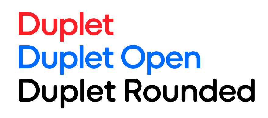
Since the Duplet fonts are geometric, the round characters and round-parts of letters appear either as circles or slanted circular forms (like you see in the italics). Letterforms are very low-contrast, with strokes that seem even in thickness. They will not disappear into the text, screen or print – even at small sizes.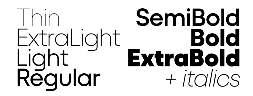
Now let’s talk about the delicious alternates. The default form of the ‘a’ in each font is single-storey. The large round bowl drives Duplet’s inherent geometry home! But there is a double-storey ‘a’ as an OpenType alternate ‘a’. The default ‘g’ is also single-story, and its bottom stroke is flattened, giving it a streamlined, almost techy look matching with the flat ’t’ and ‘f’. Duplet fonts each feature three more ‘g’ versions as alternate characters. There are also alternates for ‘k’, ‘u’, ‘G’, ‘K’, ‘M’ and the ampersand (&). The character sets include case-sensitive forms as well. Those are punctuation marks that are vertically repositioned and look better in all-caps texts. When it comes to numerals, both proportional and tabular lining figures are there – as well as fractions, superior numerals, and inferiors.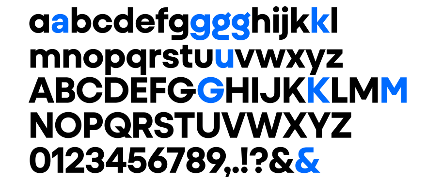
In the standard Duplet family, the letterforms’ terminals end on the horizontal. That is particularly noticeable when you look at the ‘e’ or the ‘s’. In sans-serif typefaces, this rational, high modernist trait was all the rage in the mid-20th century. It makes letters look very streamlined and engineered. At the same time, however, it can sometimes make the counters or negative spaces inside letterforms look tight or closed. They can even begin to feel claustrophobic.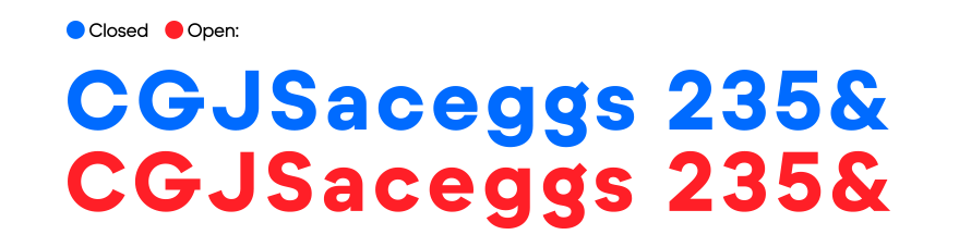
Duplet Open makes use of a completely different terminal-design strategy. Strokes on letters like ‘e’ and ‘s’ end in diagonal shears rather than horizontals. That makes the letters’ counters more open. They render a little less dark and may even be slightly more legible. 
In Duplet Rounded, the stroke terminals all across the typeface are rounded. Those endings make Duplet Rounded immediately appear more soft and friendly. All three Duplet families will work well in large type sizes, but Duplet Rounded may be the most impactful part of the superfamily when set big.
The Duplet superfamily was designed by Diana Ovezea and Rafał Buchner.
Say hello to Duplet!
Introducing Duplet: a geometric sans offering a trio of personalities. Together, the Duplet superfamily’s members have the right tone for every occasion.