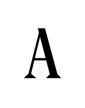
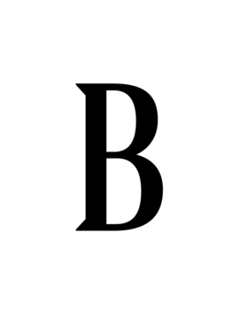
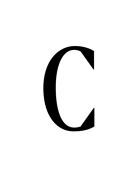
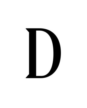
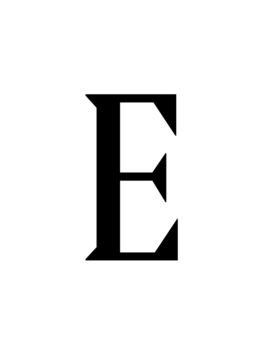
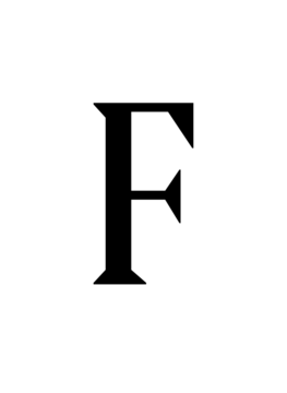
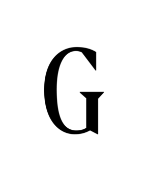
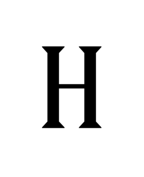
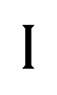
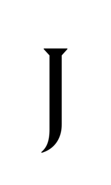
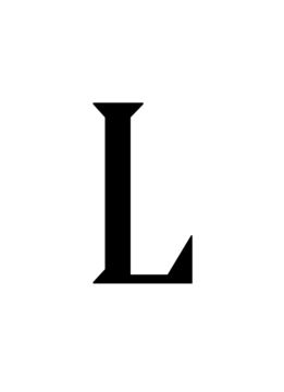
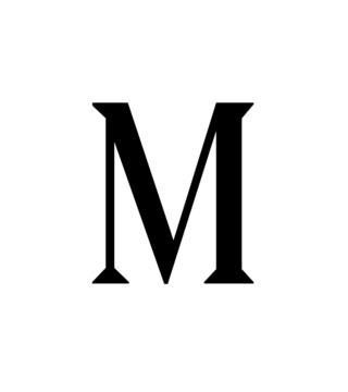
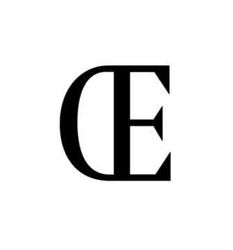
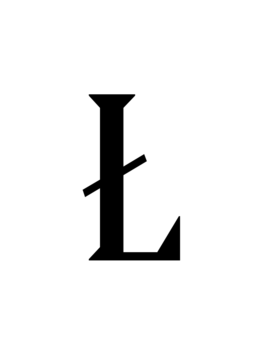
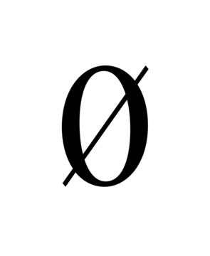
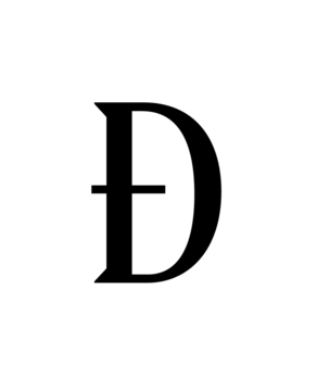
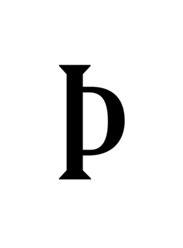
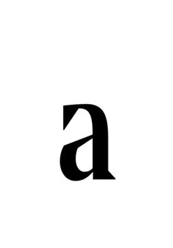
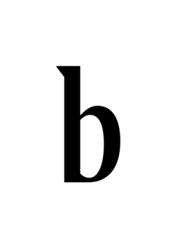
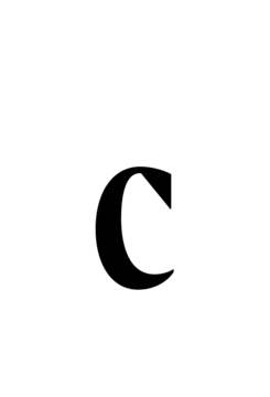
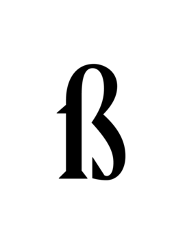
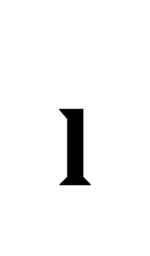
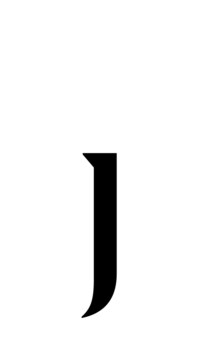
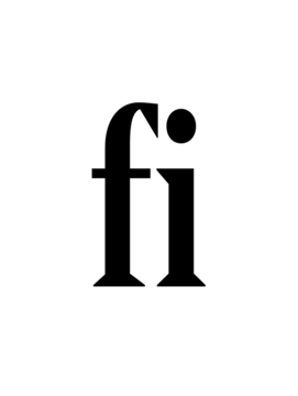
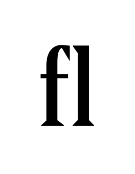
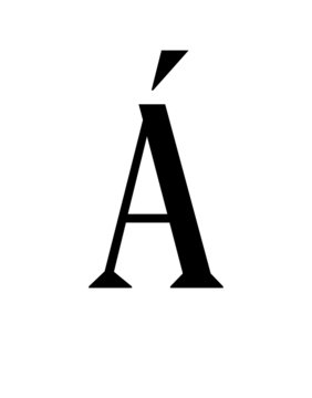
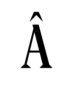
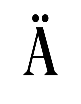
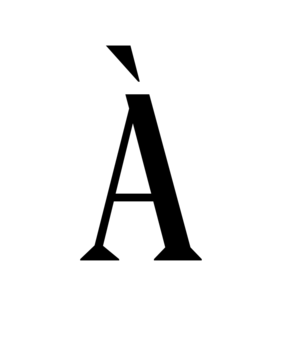
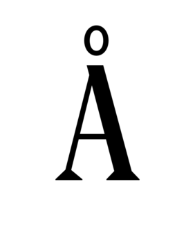
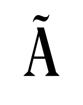
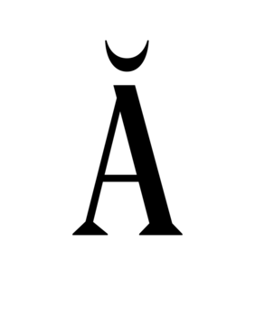
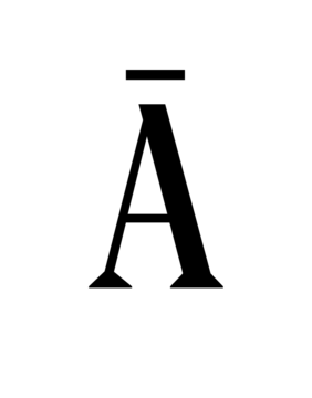
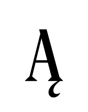
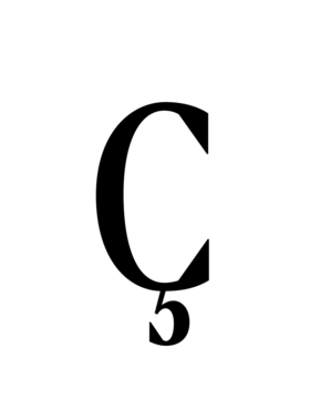
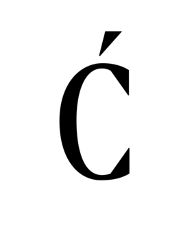
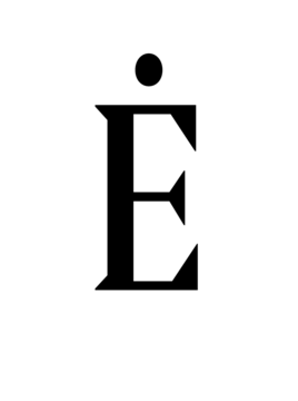
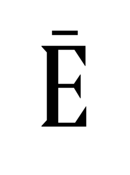
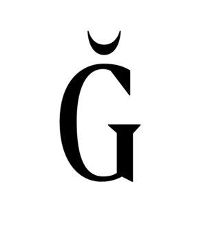
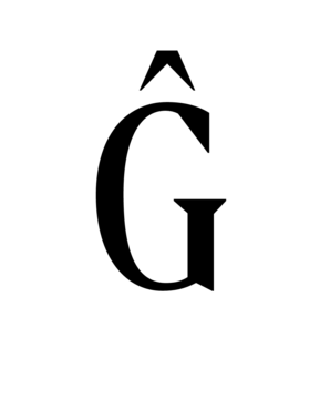
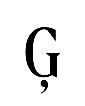
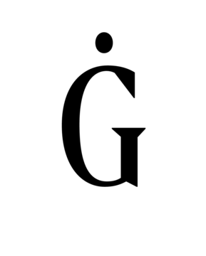
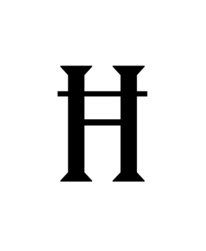
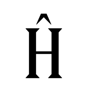
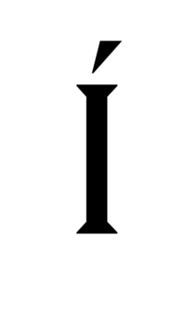
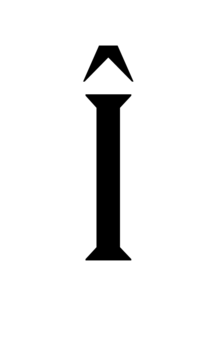
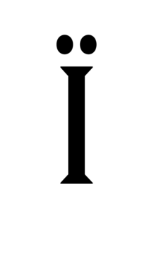
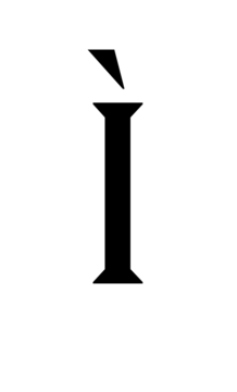
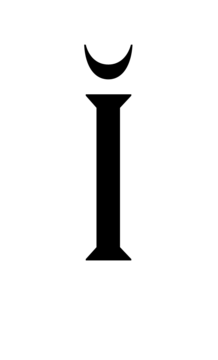
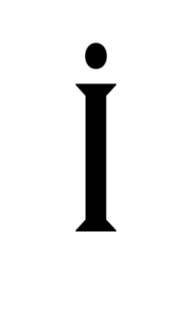
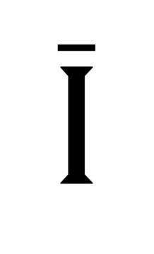
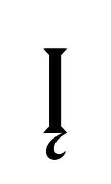
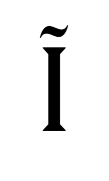
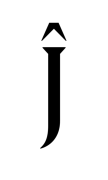
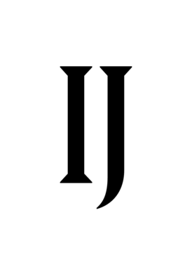
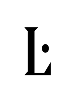
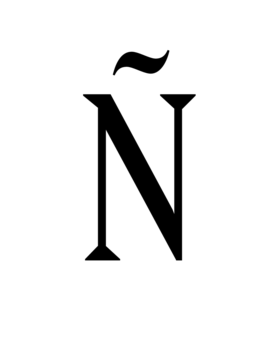
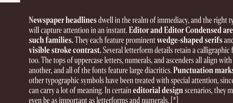
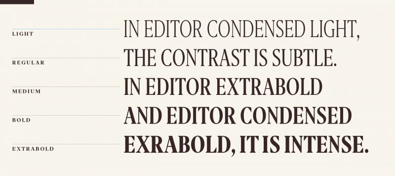
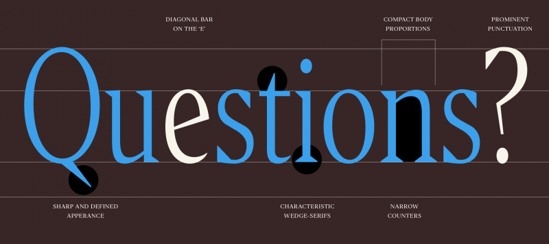
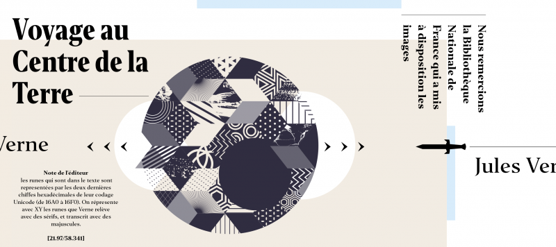
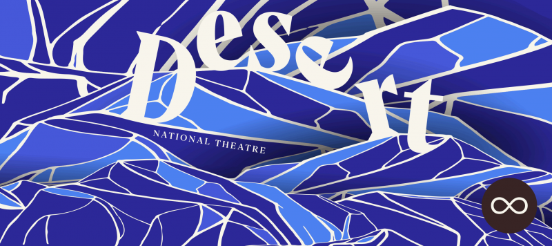
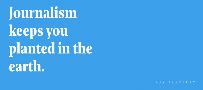
Newspaper headlines dwell in the realm immediacy, and the right typeface will capture attention in an instant. Editor and Editor Condensed are two such families. They each feature prominent wedge-shaped serifs and visible stroke contrast. Several letterform details retain a calligraphic feeling, too. The tops of uppercase letters, numerals, and ascenders all align with one another, and all of the fonts feature large diacritics.

| Family Name | Editor Condensed |
|---|---|
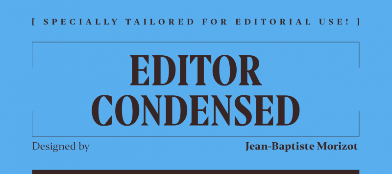
| Designer(s) | Jean-Baptiste Morizot |
| Release Date | June 20, 2016 |
| Available Style | Light, Light Italic, Regular, Italic, Medium, Medium Italic, Bold, Bold Italic, Extrabold, Extrabold Italic |
| Classification | Serif |
| Supported Languages |