The Indian Type foundry is to happy to announce the publication of three new Indian-script typefaces: Ashoka Odia, Belur Kannada, and Sandur Kannada. Ashoka Odia is our very first commercial typeface for the Odia script. Similarly, Belur Kannada and Sandur Kannada are our first Kannada-script typefaces. While Ashoka Odia began as a classroom project at India’s National Institute of Design (NID) in Ahmedabad, Belur Kannada and Sandur Kannada are the result of a successful custom type project ITF undertook several years ago.
Unfortunately, many of the Odia and Kannada fonts available on the market today still rely on proprietary software solutions for typesetting. As such, they have limits regarding the number of glyphs they can contain, and they can’t easily be used by designers in apps like those from Adobe. Like all of our products, Ashoka Odia, Belur Kannada, and Sandur Kannada are OpenType fonts. Built on the international Unicode standard, these eliminate the problems present in older fonts developed for various proprietary typesetting systems. Thanks to OpenType, all of the unique conjuncts necessary for a script-sensitive and typographically-sophisticated rendering of Kannada or Odia can finally be included in single font files. Designers, editors, and publishers no longer have to rely on non-standard keyboard work-arounds.
Ashoka Odia was created for use in long passages of text intended for immersive reading. As a design, it is truly a series of firsts: not only is it the first text typeface designed for Odia that applies Latin-style stroke contrast to the script’s letterforms, but it is also the first Odia-script font family that takes advantage of industry standards, including multiple related weights and kerning. Ashoka Odia is also the first published typeface designed by NID-graduate Pratyush Das, and it is ITF’s first commercial release for the Odia script, too.
The family includes five fonts that range in weight from Thin through to Bold. The characters feature a mild degree of visible stroke contrast; the amount of contrast remains relatively similar as you move up the scale from lighter to heavier weights. The fonts’ character sets include 270 devoted Odia-script glyphs. Thanks to the fonts’ OpenType features, these can combine into representations of all of the sounds required by the Odia language. The Ashoka Odia character set is rounded out by a series of Latin-script numerals and basic Latin punctuation marks. The typeface itself is named named after Ashoka, the famous Indian emperor who reigned in the third century B.C.E.
India’s newspaper landscape is vibrant. Printed newspapers remain one of the most-consumed forms of media in the country, and Indians read far more newspapers in their vernacular languages than English. On both the national and the state levels, competition in the newspaper marketplace is fierce. A few years ago, ITF was commissioned by the Prajavani newspaper to design a series of text and headline fonts as part of their general redesign. Karnataka’s oldest and most widely-circulated newspaper, Prajavani was founded in 1948 by K. N. Guruswamy and it has a history of quality politically-independent reporting. The typefaces delivered to Prajavani were exclusive to the paper for five years. Now, we are pleased to announce that Belur Kannada and Sandur Kannada are each available for general licensing. 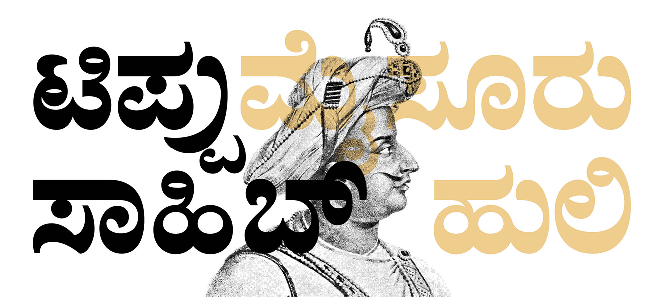
Traditionally, printed Kannada letterforms feature a distinctive amount of stroke contrast. This contrast is vertical; horizontal stokes along the top and bottom portions of each character are rendered heavier than vertical strokes. The Belur Kannda fonts incorporate this strongly-calligraphic feeling. Their letterforms have been refined for use in small sizes, and they include appropriate optical corrections and subtle ink-traps. The Kannada script employs many below-the-base forms, which create complex conjuncts and require loose vertical metrics settings. Many of the conjunct forms in Belur Kannda have been simplified, in order for them to require less space below the baseline, allowing for more lines of text per text block. Belur Kannda has five weights, ranging from Light to Bold. Thanks to the Kannada script’s stroke contrast, the characters in Belur Kannda’s five weights are relatively close to one another in width. The same characters from each of the fonts all almost look as if they were quintuplexed with one another.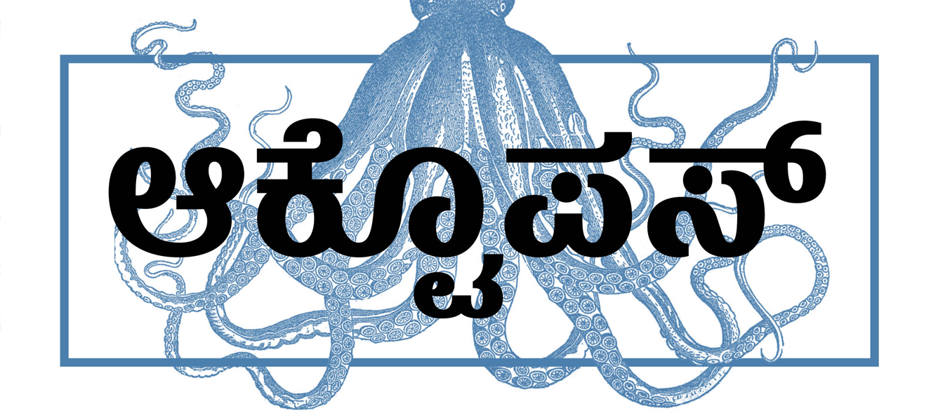
While Belur Kannada was designed for text, Sandur Kannada is a family of display typefaces. Its fonts reverse the traditional Kannada-script stoke contrast. The result is a vertically-stressed condensed typeface. The lightest weight in Sandur Kannada is almost monolinear, while the boldest weight features a great deal of contrast. This allows the stress to subtly gradate from weight to weight, along the axis that runs from Light to Bold. Sandur Kannada’s condensed proportions make it suitable for setting headlines and other short large-sized texts. Of course, Sandur Kannada works well with the text-optimised Belur Kannada fonts, even though each family has a strong difference in stroke-contrast models. Like Belur Kannada, Sandur Kannada comes in five weights. And what do their names mean? Belur and Sandur are cities in the Indian state of Karnataka. Both the Belur Kannada and the Sandur Kannada typefaces were designed in Ahmedabad by ITF co-founder Satya Rajpurohit.