In India, four of the six most-read writing systems in the world are used in official capacities – Arabic, Bengali, Devanagari, and Latin. So it should be no surprise that the Indian Type Foundry’s designers often develop fonts for the Latin script. English is a common element of Indian advertising and design, and thanks to our webshop, ITF also has customers around the world. Today, we are pleased to introduce you to our newest Latin script releases: Caravel, Mute and Akhand. Each of these families represents a different sub-category of sans serif typefaces. Caravel is a gothic, Mute is a humanist sans, while Akhand is narrow and constructed in its appearance.
Caravel
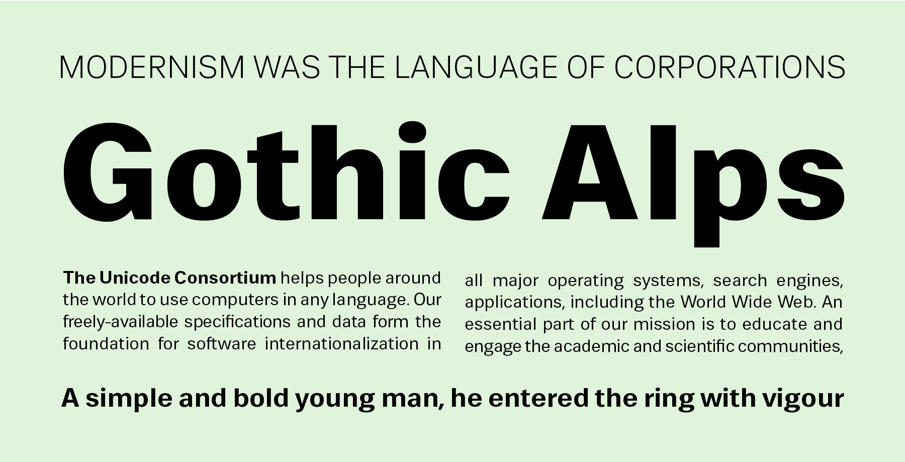
Caravel is a family of five fonts. Jonny Pinhorn spent three years developing his sans serif, from 2012 until 2015. While the grotesk style is a well-tread area in type design, Pinhorn still manages to offer an original contribution to the field with Caravel, particularly in the way its lowercase and non-alphabetic characters are drawn. Caravel’s lowercase “a” features a roundness that allows for weight interpolation while also maintaining a level of friendliness that is just not common in grotesks. The ascenders and descenders of Caravel’s lowercase letters are quite short, and the treatment of the double-storey lowercase “g” is noteworthy for the way it fills up the small space allotted to it without sacrificing clarity. Glyphs such as the ampersand and the at-symbol show much more character than is expected. Oldstyle figures are also available to users via OpenType features – yet another uncommon characteristic for a gothic. Finally, Caravel’s character set (420 glyphs per font) is quite international. In addition to dollar, euro and sterling currency symbols, the fonts feature the Indian rupee – naturally – as well as symbols for the Turkish lira and the Russian rouble.
Mute
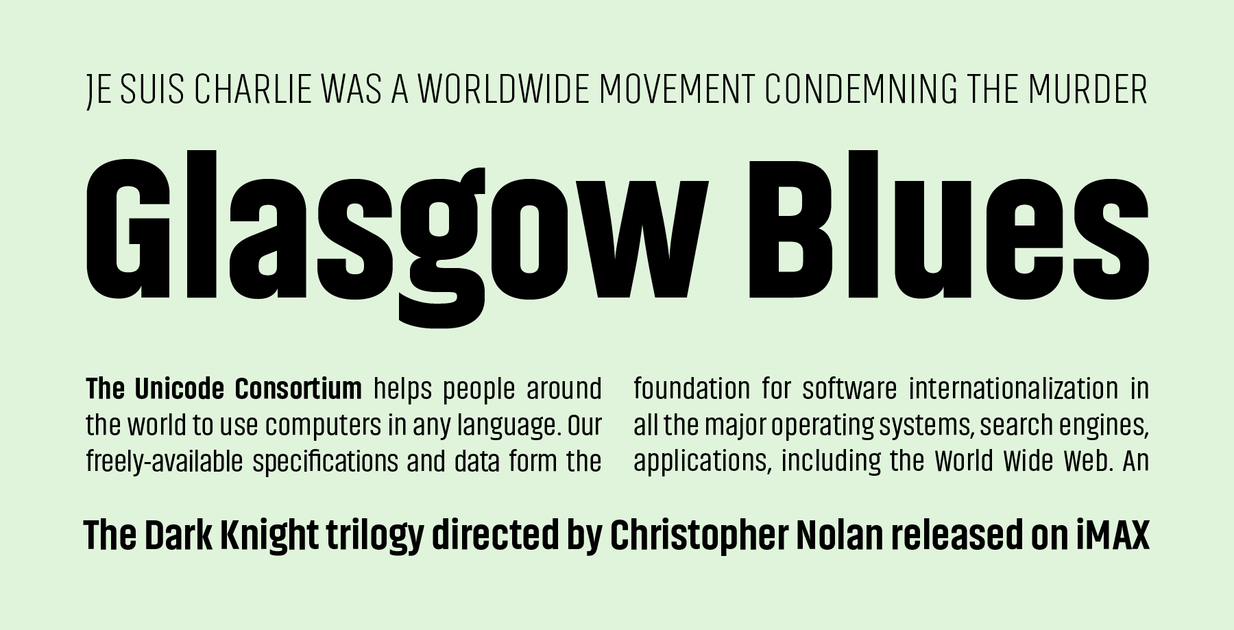
Mute was initially developed for User Interface design. Its humanist-style letters are seemingly monolinear and most strokes have flat endings. These terminate either in horizontal or vertical shears instead of diagonals, and this abruptness helps create clear-cut counter forms between characters. Mute’s letterforms feature apertures that are quite open, and indeed the entire family feels very legible in text. There are five styles available, each with 386 glyphs. Mute is a solid UI design tool and a wise selection for electronic display embedding, designed by ITF's in-house designer Manushi Parikh.
Akhand
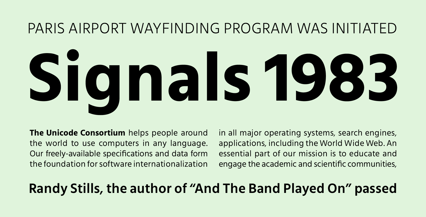
Akhand has eight fonts on offer, and is particularly different from Caravel and Mute in that it is intended for use in display sizes, rather than smaller text. With its condensed and straight-sided letterforms, Akhand looks very constructed. While the design of the family is based on modular elements, not every aspect is too technical in its details. There are plenty of unexpected rounded elements and twists that come up in the design. Akhand’s space-saving width helps increase its usefulness in logos and headlines. It looks particularly interesting when its different weights are combined together. Each weight in the the family includes 390 glyphs. Akhand was designed between 2013 and 2015 by Satya Rajpurohit and the design is part of the larger Akhand super family, which covers a wide variety of Indian scripts.