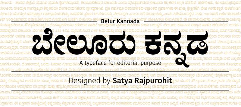
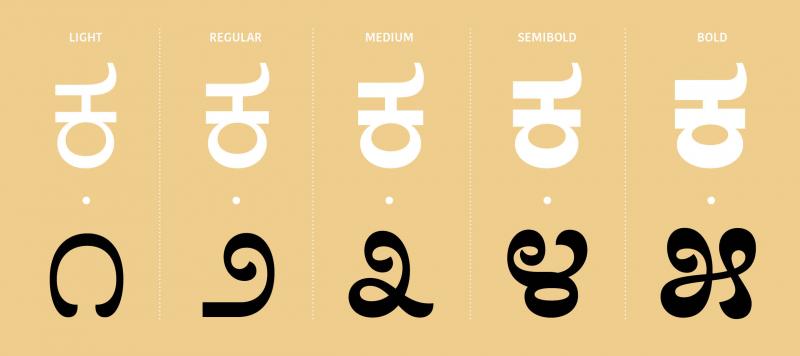
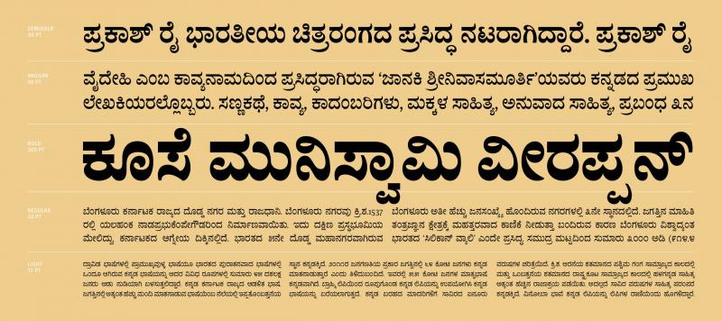
Traditionally, printed Kannada letterforms feature a distinctive amount of stroke contrast. This contrast is vertical; horizontal stokes along the top and bottom portions of each character are rendered heavier than vertical strokes. The Belur Kannda fonts incorporate this strongly-calligraphic feeling. Tetterform details have been refined for use in small sizes, with appropriate optical corrections and subtle ink-traps. The Kannada script employs many below-the-base forms, which create complex conjuncts and require loose vertical metrics settings. Many of the conjunct forms in Belur Kannda have been simplified, in order for them to require less space below the baseline, allowing for more lines of text per text block. Thank to the Kannada script’s stroke contrast, the characters in Belur Kannda’s five weights are relatively close to one another in width. And what does the name mean? Belur is a city in the Indian state of Karnataka. Belur Kannada was designed in Ahmedabad by ITF co-founder Satya Rajpurohit.


| Family Name | Belur Kannada |
|---|---|
| Designer(s) | Satya Rajpurohit |
| Release Date | July 24, 2017 |
| Available Style | Light, Regular, Medium, Semibold, Bold |
| Classification | |
| Supported Languages |