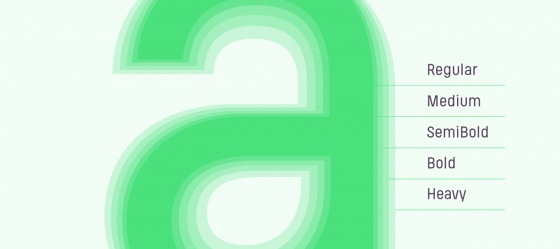
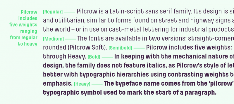
Pilcrow is a Latin-script sans serif family. Its design is simple and utilitarian, similar to forms found on street and highway signs around the world – or in-use on cast-metal lettering for industrial products. The fonts are available in two versions: straight-cornered and rounded. While the normal Pilcrow fonts have sharp corners at their stroke terminals, Pilcrow Soft’s have been filed down. Pilcrow and Pilcrow Soft each include five weights: Regular through Heavy. In keeping with the design’s mechanical nature, the family does not include Italics, as Pilcrow’s style of letter fits better with typographic hierarchies using contrasting weights to define emphasis, whereas Italics use slants or a cursive stroke pattern.
Pilcrow’s glyphs have square-like proportions, although most of them are narrower than perfect squares. While the typeface does have a monospaced feeling in longer passages of text, the glyphs are proportionally-spaced. Each glyph’s width increases just slightly as one goes up the family’s weight scale. A benefit of typefaces created for utilitarian purposes is that their clean and simple letterforms often increase legibility onscreen. Pilcrow is particularly suited for short texts on websites or for newsticker-scrollbars on television. Because of web 2.0-style logos that have been popular in the past decade, Pilcrow’s Soft version appears particularly suited for use in ‘tech’ applications. The Pilcrow Soft fonts have a friendlier appeal to them, contrasting with the harder look of the Pilcrow fonts’ squared-off strokes.
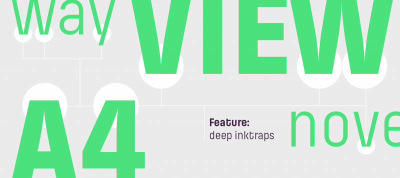
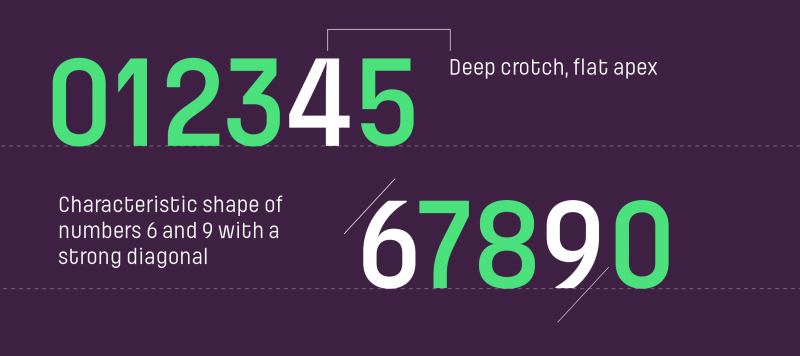
Deep cuts, or large crotches, are a prominent feature of Pilcrow’s design. They are especially visible in the uppercase ‘A’, ‘M’, ‘N’, ‘V’ and ‘W’, as well as in the lowercase ‘v’, ‘w’, ‘y’ and the numeral ‘4’. In the bolder weights, these junctions fill in, but slight ink traps still remain visible. The counter forms of Pilcrow’s letters are very large: in the lowercase ‘a and ‘e’, for instance, which are more closed than open, the size of these negative spaces is still very apparent. The large counters achieve a more open shape in letters like ‘K’ or ‘k’, where the diagonals don’t collide with the vertical stroke. The lowercase ‘u’ is geometric, and not based on handwritten forms; instead of a full vertical stroke on its right-hand side, it has a semi-circular base. Some letters are full of ‘character’ in an almost dramatical sense – like the lowercase ‘t’, which is reminiscent of Eurostile or House Gothic, or the numerals. Because of the strong diagonal strokes in the ‘6’ and the ‘9’, there is no danger of these being confused with figures like ‘5’ or ‘8’.
The typeface name comes from the ‘pilcrow’ (¶), a typographic symbol used to mark the start of a paragraph.