Newspaper headlines dwell in the realm of immediacy. The right typeface will capture attention in an instant, but a design intended for body text is often not going to cut it. Tools optimised for Editorial Design are necessary. To fit this bill, the Indian Type Foundry is pleased to present the new Editor and Editor Condensed families. Each includes five fonts, ranging in weight from Light to Extrabold.

Editor is a serif design for the Latin-script. But Editor is also a ‘Latin’-style typeface, meaning that it has serifs which are pointy triangularly-shaped wedges. Editor’s wedge serifs are more than just an element of its design; they are the most-defining feature of the typeface. However, there a number of other noteworthy items in Editor’s design, too. All of the’ weights have visible stroke contrast, meaning that the thin parts of the letterforms are noticeably thinner than the thicks. With each increasing weight, the degree of stroke contrast in the letterforms increases: In Editor Light and Editor Condensed Light, the contrast is subtle. In Editor Extrabold and Editor Condensed ExraBold, it is intense.
Although Editor’s stroke contrast generally follows a vertical model, with the thinnest parts of each letter falling at the very tops and bottoms of curves, some letterforms include humanist features. For example, the middle stroke of the lowercase ‘e’ is diagonal. This is mirrored by the counterforms inside the lowercase ‘a’. The lowercase ‘g’, despite not having any prominent diagonal strokes, is also quite humanist in its appearance. Editor’s humanism also allows for whimsicality to enter the typeface’s design – a prime example for this is the question mark’s outstroke.
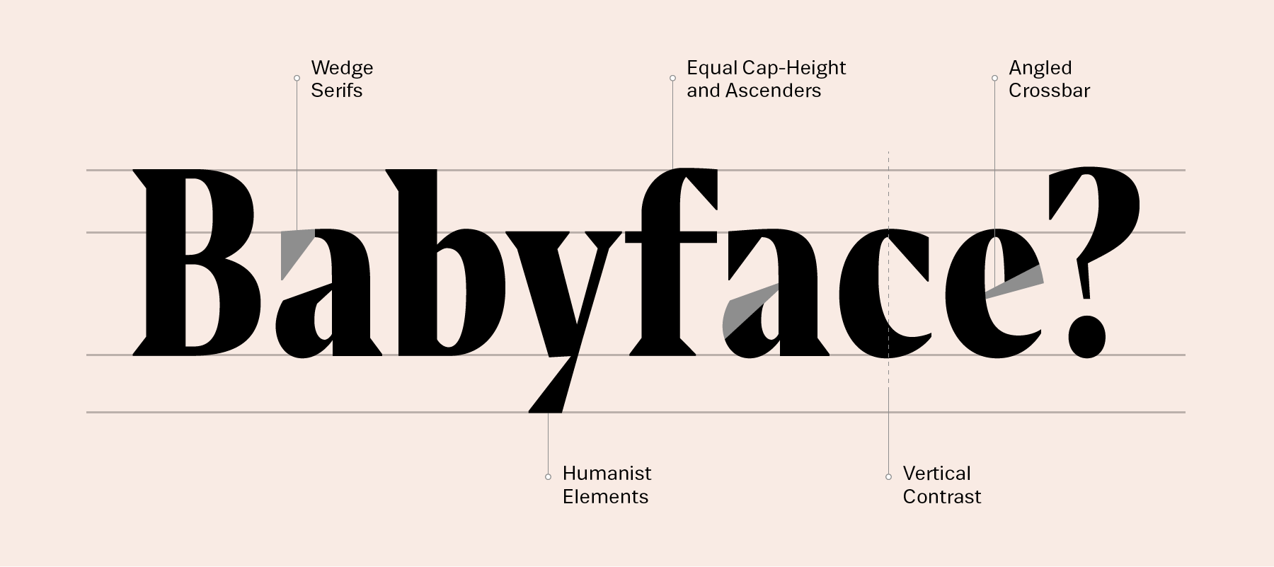
Several of Editor’s design details retain a calligraphic feeling, like the nose of the lowercase ‘g’, the beak of the lowercase ‘r’, and the pointy tail of the capital ‘Q’. Both Editor and Editor Condensed share the identical vertical proportions; the tops of uppercase letters, numerals, and ascenders all align with one another. In Editor, the normal-width typeface, letterforms all have a rather wide stance. Many of the capital letters look almost equal-width in their proportions. All of the fonts feature large diacritics for optimal legibility in text sizes.
Editor and Editor Condensed are both designed by Jean-Baptiste Morizot in Paris. This is Morizot’s third release with ITF. Together with Alisa Nowak and Julie Soudanne, he designed the Graphico family. He is also the designer behind Bobo.