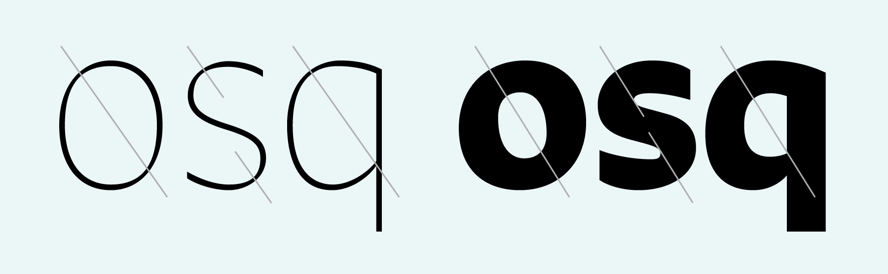
Meet Khang, our newest Latin script sans serif family. This face began as an experiment in Shiva Nallaperumal’s ongoing investigations into the definitions of monolinearity in type design. What would happen if a strictly monolinear sans typeface was fused together with the logic behind writing letters with a broad pen? In designing Khang, Shiva used the idea of stroke modulation itself as the typeface’s defining characteristic; the letters “Q” and “&” illustrate this modular principle clearly. The resulting “calligraphic strokes meet a contemporary sans serif structure” typeface, is not your typical humanist-style sans serif.
Unlike most calligraphic sans serifs, Khang takes after a neo-modern-humanist model, which is predominantly monolinear (e.g, FF Milo Sans, Fedra, etc.).Shiva thus maintained a degree of neutrality, while avoiding an artisanal or “hand crafted” feeling in Khang. Shiva isn’t the first designer to tackle this kind of hybrid typeface; he was inspired by previous attempts by the late Dutch designer Evert Bloemsma – particularly FF Balance and FF Legato.
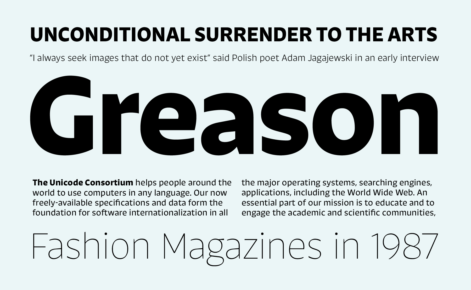
The Khang family currently includes six weights – Extralight, Light, Regular, Medium, Semibold and Bold. Even in the Extralight weight, the typeface’s modularity is maintained – quite an accomplishment, we think. As a typeface, Khang is suitable both for long, comfortable reading and interesting display uses. It features compact, almost monolinear capital letters. The lowercase letters have a tall x-height. Ascenders feature diagonal shears – which of course are hallmark broad pen artefacts that add sparkle and character to the design. Similar pen remnants are visible in the forms of the lowercase “a” and “g”, too. Aside from these, all strokes end with either horizontal or vertical cuts. All of the letters have quite open counterforms; the apertures in “G” “S” “a” and “e” are also large. The lowercase “f” has a high waist. The leg of the capital “R” is rather Adrian-Frutigery.
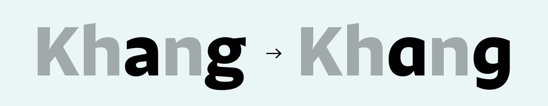
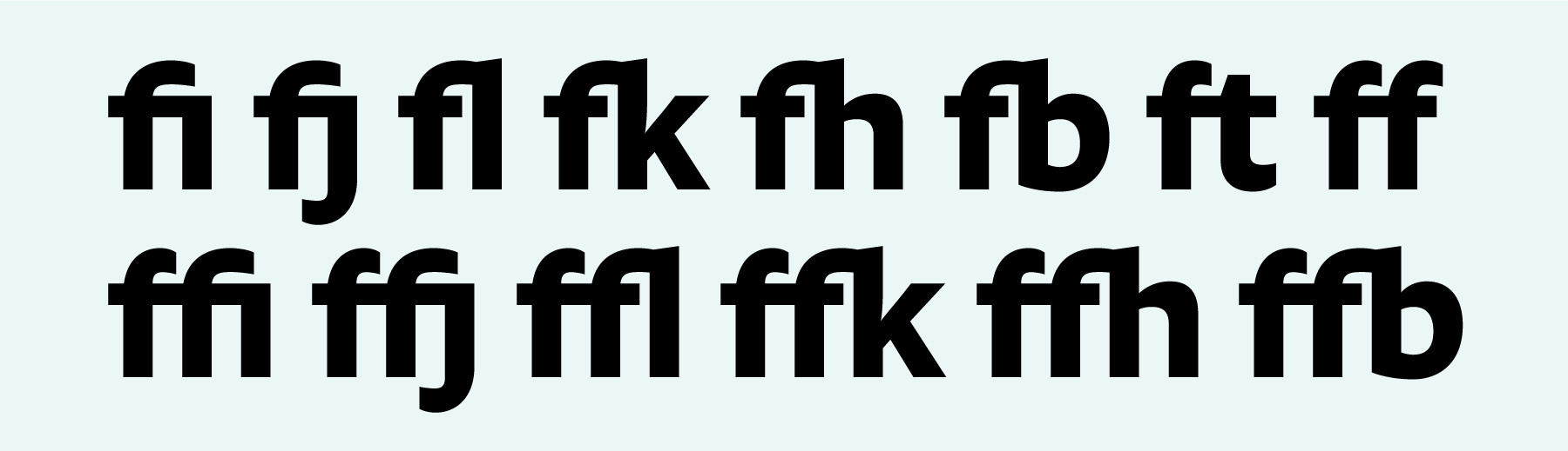
Each of Khang’s fonts includes a character set with 434 glyphs. This ensures that all modern languages written in the Latin script may be set with Khang – including English and the languages of Western, Central, and Eastern Europe. Khang offers a few OpenType features that may prove helpful for Corporate Identity and Editorial designers: each font includes alternate single-storey “a” and “g” forms – including alternate glyphs for all of the diacritical letters that “a” and “g” can take. These are accessible via a stylistic set in InDesign or in CSS, or as via the stylistic alternates feature in Illustrator. Khang’s fonts also include 15 f-ligatures, plus a “tt” ligature.
And where does the name “Khang” come from? While Shiva was preparing for his thesis show at MICA in Baltimore, he promised his friend Daniel Khang that if Khang helped him with the huge amount of vinyl in his exhibition, Shiva would name his next typeface after him. It took Shiva almost 7 months to keep his end of the deal. Now back in India, Shiva is an in-house designer at ITF. His first typeface for us, Pancho, was released earlier in 2015.