The Indian Type Foundry’s releases for this November include two new German-style sans serif families: Volkart and Weissenhof Grotesk. Each of these typefaces interprets a different chapter in design history. Sans serifs are the face of 21st century communication, but they only came onto the scene relatively recently. English type founders published the first sans serifs almost 200 years ago; by the end of the 19th century, German foundries had developed the most-popular designs for jobbing printing. These are the types we call “grotesks” in English; in German that is just another word for “sans serif.” While more revolutionary sans styles appeared during the 1920s, the pioneers of international graphic design went back to the earlier grotesk style of the 1890s. Since the 1950s, graphic design without this neo-grotesk style of type has been unthinkable. Although Volkart does not have the word “grotesk” in its name, it is the neo-grotesk of this month’s two releases. Weissenhof Grotesk is based on one of those “other” revolutionary styles implied above
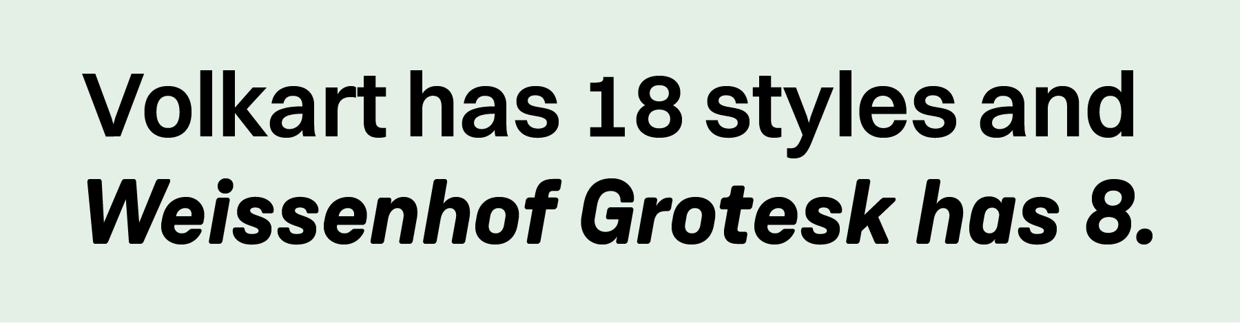
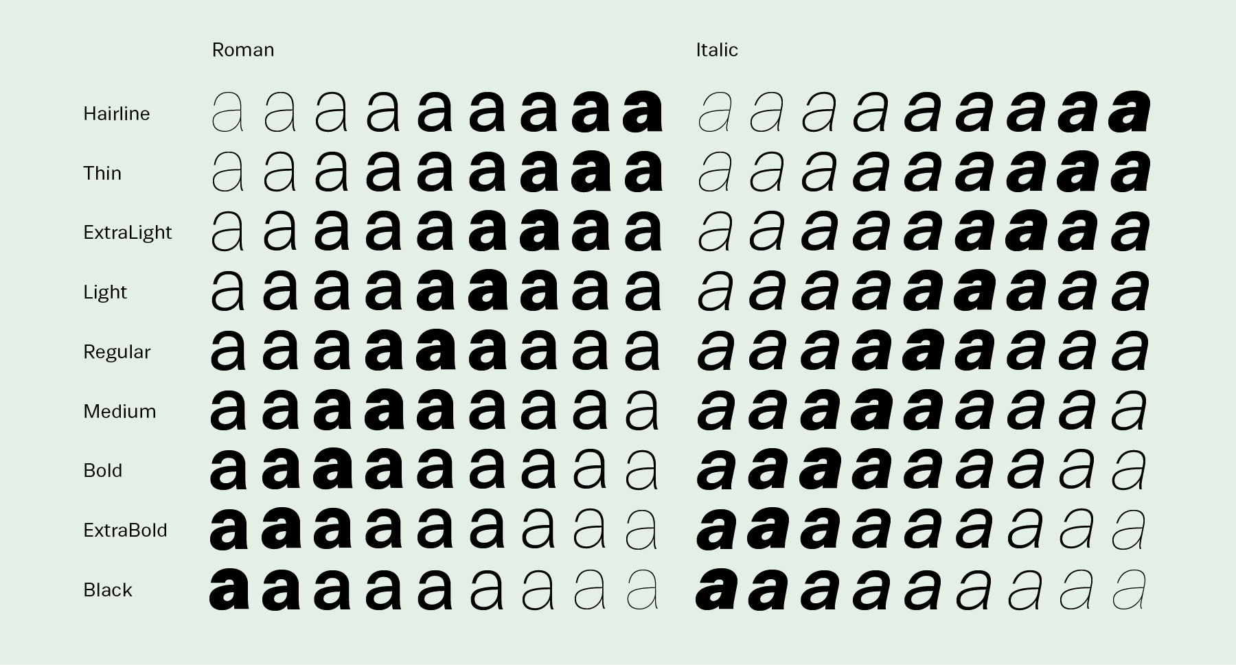
Both typefaces Volkart and Weissenhof Grotesk are all-purpose Corporate Design tools. Volkart has 18 styles; these include nine weights, each of which have italics: Hairline, Thin, Extralight, Light, Regular, Medium, Bold, Extrabold, and Black. Weissenhof Grotesk is an eight member family: its Light, Regular, Medium, and Bold weights each come in upright and italic variants, too. Volkart and Weissenhof Grotesk’s fonts include 385-glyph character sets supporting all common European languages that are written with the Latin script.
Volkart
While Volkart might resemble earlier typefaces, it is a new design that has been made for our time. Volkart has the look of a classic; it is the first neo-grotesk you should consider for your next re-branding project. Even if your studio already has its own favourite neo-grotesk, we encourage you to reconsider your font stacks. Volkart was conceived for screen and print-use simultaneously, from the moment the very first letters were drawn.
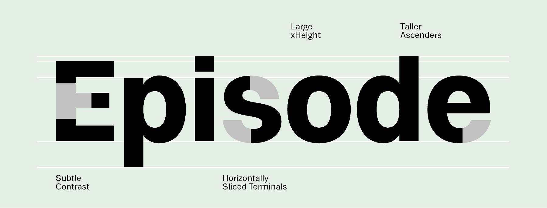
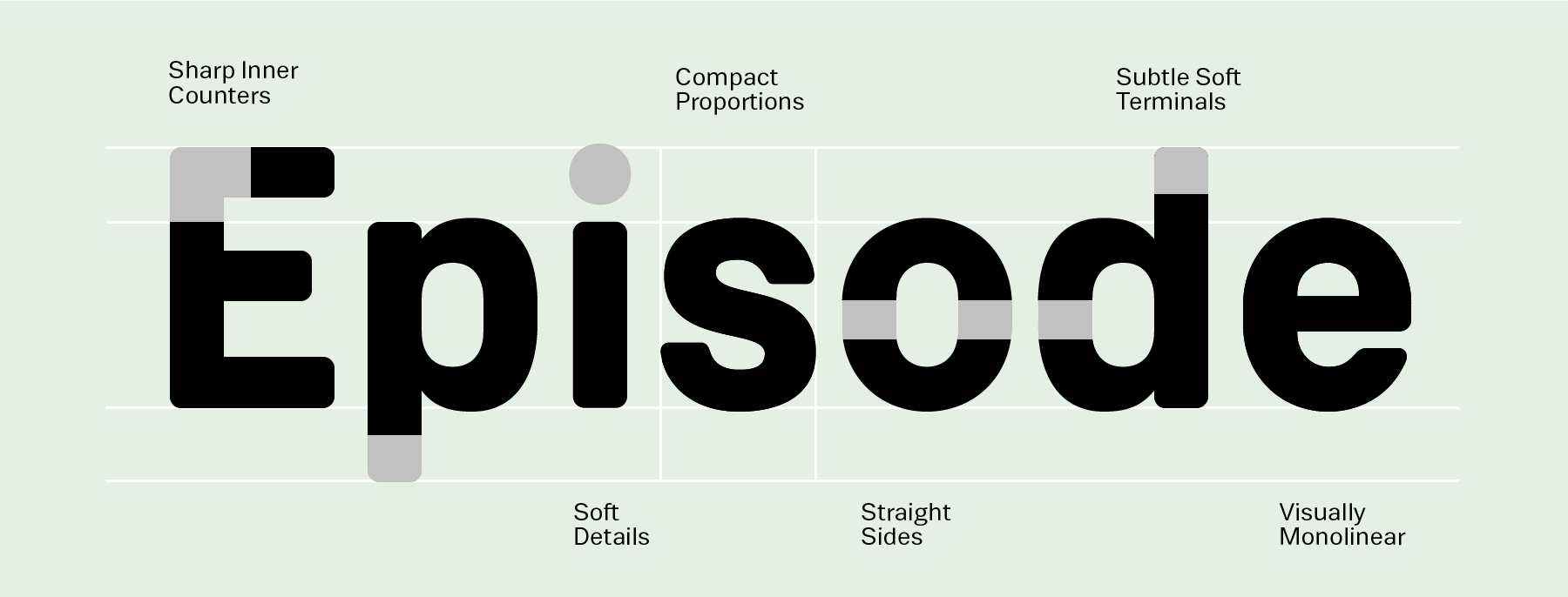
What are some of Volkart’s neo-grotesk design features? For starters, the family appears quite monolinear. Stroke terminals end in either horizontal or vertical cuts, instead of diagonals. The capital letters are quite similar to one-another, in terms of their relative widths; these are modernist/industrial proportions, not old-fashioned Roman capitals. Volkart’s lowercase letters have a very high x-height, and most of the letters are round. The apertures are small and the letters’ counter forms are closed. The shapes of the diacritics are minimalist – their forms are almost geometric. The italic fonts are corrected-obliques, not cursive-style type.
Weissenhof Grotesk
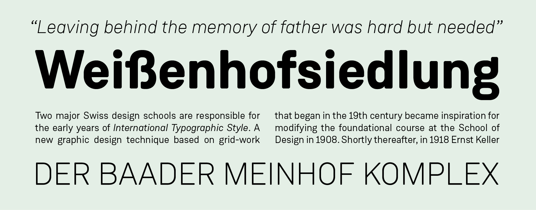
Almost all of the above-mentioned features could also be used to describe Weissenhof Grotesk, too. Why is it that Weissenhof Grotesk, then, looks so different from Volkart? Weissenhof Grotesk is a family inspired by an ideal, rather than a specific style of typefaces. Its name pays tribute to the architecture of the Weissenhofsiedlung, or Weissenhof Estate. This ensemble, built in 1927, was the most significant architectural achievement of the Weimar Republic era. Almost every modern architect of the period was involved, including Peter Behrens, Le Corbusier, Walter Gropius, and Mies van der Rohe. Refreshingly, Weissenhof Grotesk is not a pastiche of Bauhaus-inspired letterforms; its designers do not rely on that kind of stylistic shorthand. If anything, the typeface is similar to the style of DIN-lettering initially used on railway cars and engineering plans. The corners of Weissenhof Grotesk’s stroke endings are rounded-off, but this is not a “rounded” typeface. Its letterforms actually take inspiration from common architectural features; such as curves combining with straight segments. A straight-sided “o”, for instance, acts as a pattern for many other letters, sich as the b c d e p and q. Weissenhof Grotesk features monolinear strokes and a good amount of contrast between the stroke thickness of each weight. Letter proportions tend toward equalisation, without Weissenhof Grotesk becoming a monospaced design. Even the typeface’s numerals, surprisingly, are proportionally-spaced.
Two Stuttgart-based designers – Stefanie Schwartz and Dirk Wachowiak – developed Weissenhof Grotesk for ITF, while the Paris-based Jérémie Hornus is behind Volkart. Volkart is his second ITF release; together with Clara Julien and Alisa Nowak, he designed the Diodrum family that we published earlier in 2015. Hornus’s Volkart typeface is our largest family of Latin-script fonts to date. For the name, it is inspired from the Volkart Trading Company. This was the first multi-national enterprise with both Indian and Swiss operations. Their Bombay office opened in 1851, and the firm played an important role in fostering early ties between the two countries. While the neo-grotesk style didn’t originate in Switzerland per se, some of the most-famous neo-grotesks do come from Swiss designers.