Quantum is a multi-script family from Hitesh Malaviya, whose Brahmos typeface also debuted in 2015. In terms of its appearance, the Quantum family is a very extended display sans serif. Surprisingly, wide faces are a rare typographic commodity; the market just does not have many of them. Perhaps this is because they are not the most economic typefaces: they take up a lot of space, they can be harder to read comfortably, they aren’t what audiences may be used to, etc. However, their rarity may also increase their effectiveness as display faces. Type used at display sizes must grab attention if its message is ever going to get through to readers.
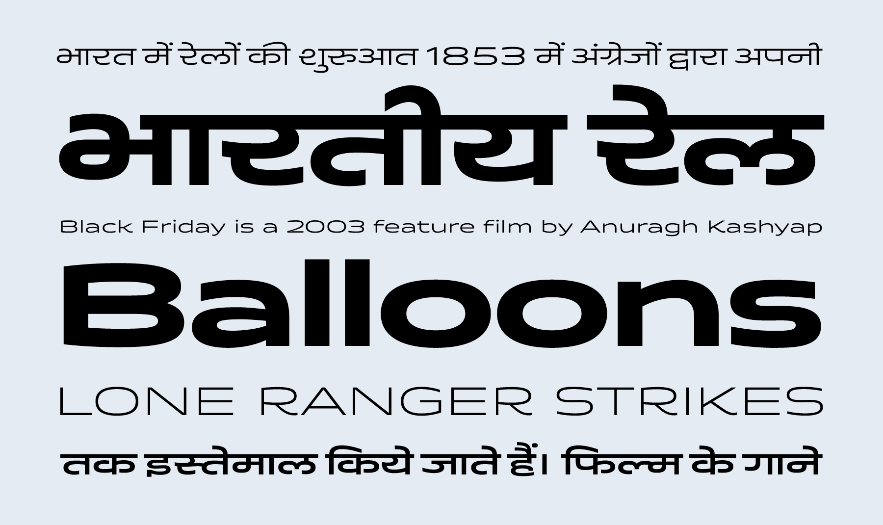
Quantum’s width is like that of Mid-Century Modern furniture, with a livelier appearance than actual typefaces from the middle of the 20th century. Currently, Quantum’s multi-script design supports the Devanagari and the Latin scripts. No matter which script, though, Quantum’s wide letterforms have curved or rounded elements in them. Much emphasis has been placed on these letters’ arches, and they keep text set in Quantum from looking too technical – a fate that can easily befall sans serifs. Quantum’s stroke endings are vertical, like in a humanist sans.
A number of elements stand out in Quantum’s character set. There is a double-strorey ‘a’ mixed with a single-storey ‘g’. The typeface’s rounds swell outward and upward, particularly in the capitals ‘B,’ ‘D,’ ‘P,’ and ‘R.’ The letters ‘K,’ ‘Q,’ ‘R,’ and ‘k’ each have curved tails on the out-strokes of their lower diagonals. Dots on ‘i’ and ‘j,’ as well as in accents and punctuation marks, are wide and flattened. The ampersand has a simplified form recalling the ‘Et’ ligature that caused the character to be invented in the first place. Quantum’s at-symbols align nicely in text.
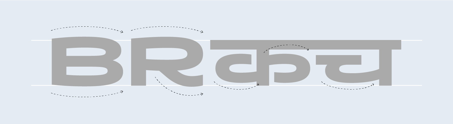
Marks above and below the Devanagari base characters are simplified in the Quantum Devanagari family. Dependent vowels are monolinear strokes, and the reph has less of a curve than usual (it looks more like the slow drag of a ruling pen than the typical ‘pot-hook shape’ based on broad-nib calligraphy rules). The consonants ‘ka,’ ‘cha,’ ‘ddha,’ ‘tha,’ ‘ba,’ ‘bha,’ ‘va,’ and ‘sha’ all have open counters. There is no loop on the ‘ga,’ and the loops in ‘na,’ ‘bha,’ and ‘ma’ are closed. Quantum Devanagari’s five weights each have 760 glyphs, which include all of the necessary conjuncts and ligatures for the proper typographic rendering of languages written with the Devanagari script. Most of the Quantum Devanagari’s conjuncts are horizontal, rather than vertical, which reinforces the overall wide nature of the typeface.