This April, the Indian Type Foundry is pleased to announce the release of three very different Latin-script typefaces: Tabular, Spencerio, and Quantum Rounded. The names of each of these give hints about their designs; Tabular is a family of monospace sans serif fonts, while Spencerio is a formal, Spencerian-script face. Quantum Rounded is an addition to our Quantum Multi-Script series, first released in 2015. Tabular and Spencerio were both developed by the Paris-based designer duo of Jeremie Hornus and Julie Soudanne, while Quantum Rounded is another great typeface from Hitesh Malaviya in India.
Tabular
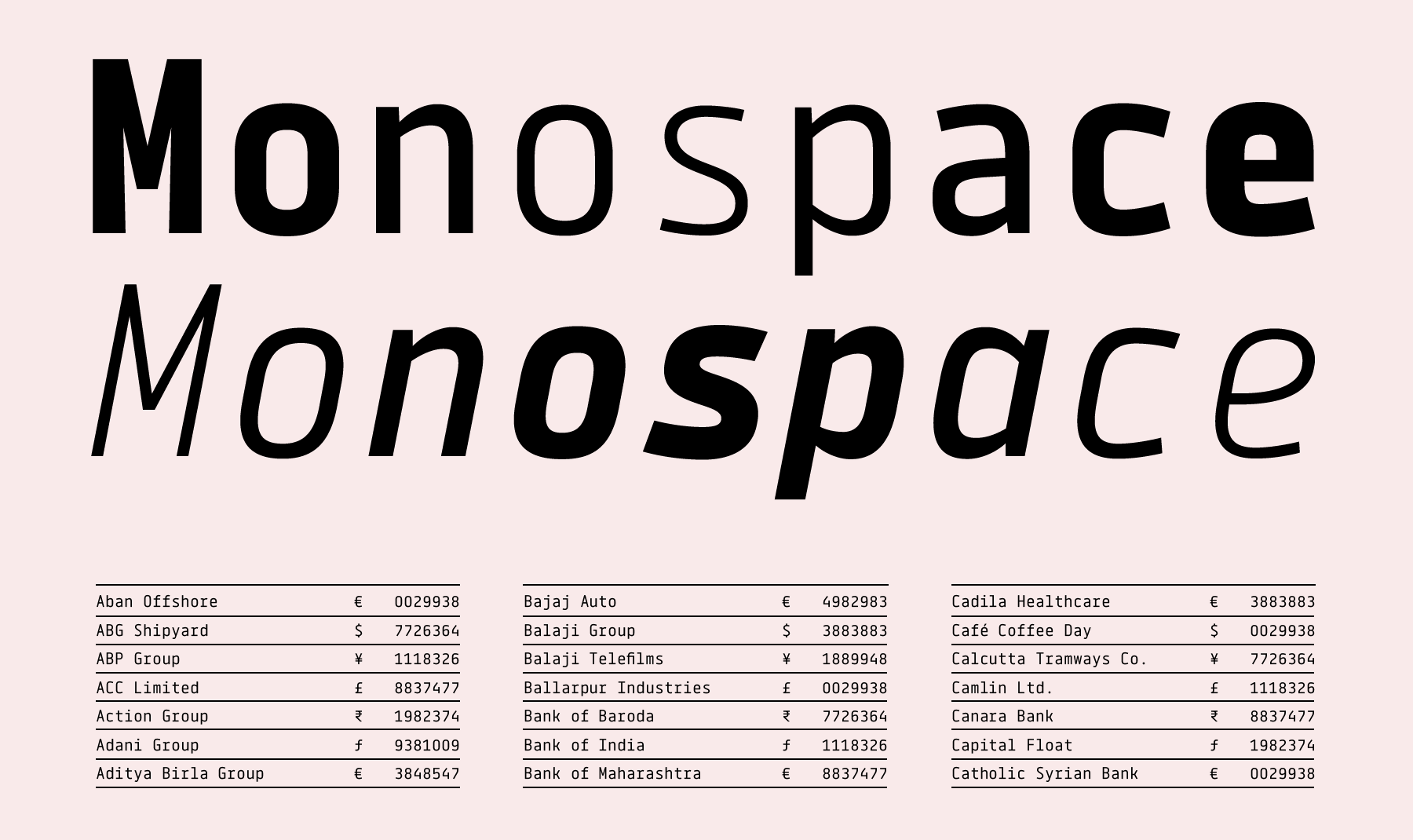
As a family, Tabular includes ten fonts. Five are uprights, and each of these weights has a companion italic. All of the glyphs in the family share the same advance width – 600 em units – which means that your line-wrap will not affected when part of a text becomes emboldened or italicised. Tabular’s advance width is slightly compact for monospace fonts; especially in the heavier weights, the stylistic play between extended narrow letters and compressed wide letters is therefor very intriguing. Great attention has been paid to the details of characters that some might view as being ‘less important,’ and it is here that Tabular really shines. For example, Tabular’s fractions are stacked. Special characters, like the percent sign, the at symbol, and currency symbols, are drawn in innovative ways.
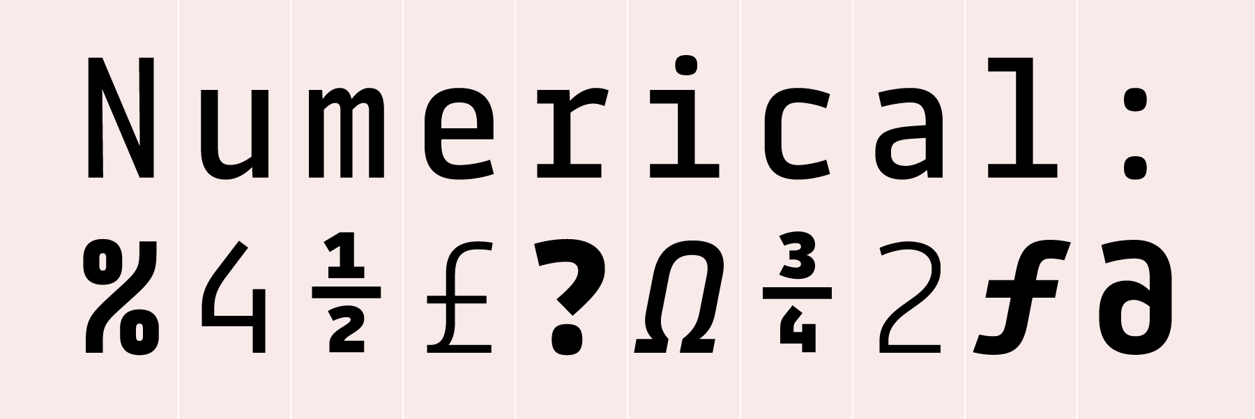
We recommend Tabular for onscreen-use in apps or website for displaying code, and in print for areas where monospace fonts are essential (such as financial reporting). Tabular would also be a noteworthy in print designs including lots of numerals, such as letterheads that juggle multiple telephone numbers.
Spencerio
While Tabular is a ten-font family, Spencerio is a single-style script face. The typeface’s letterforms are inspired by the popular Spencerian calligraphic style. Spencerian letters, which are written at a slant (or slope), are formed with a pointed pen. The natural state of each stroke is a thin hairline; but when the calligrapher wants to create a thicker line in order to add contrast, all that she need do is to add pressure to the nib at the right point of the stroke. Sounds easy, doesn’t it? Unfortunately, it takes years of practice for calligraphers to master the Spencerian style! Most graphic designers prefer to apply a typeface instead. Spencerian uppercase letters are characterised by their peculiar ornateness, and Spenceriodoes not fail to deliver here. Almost all capital letters include multiple loops (some of which are open, while others are blind counters), swells, and swirls. Some letters have additional detail – such as ‘A’ or ‘K’ – and others have long, descending swash elements. Particularly the out-strokes of the ‘L’ and ‘Q’ can be used to create powerful word shapes.
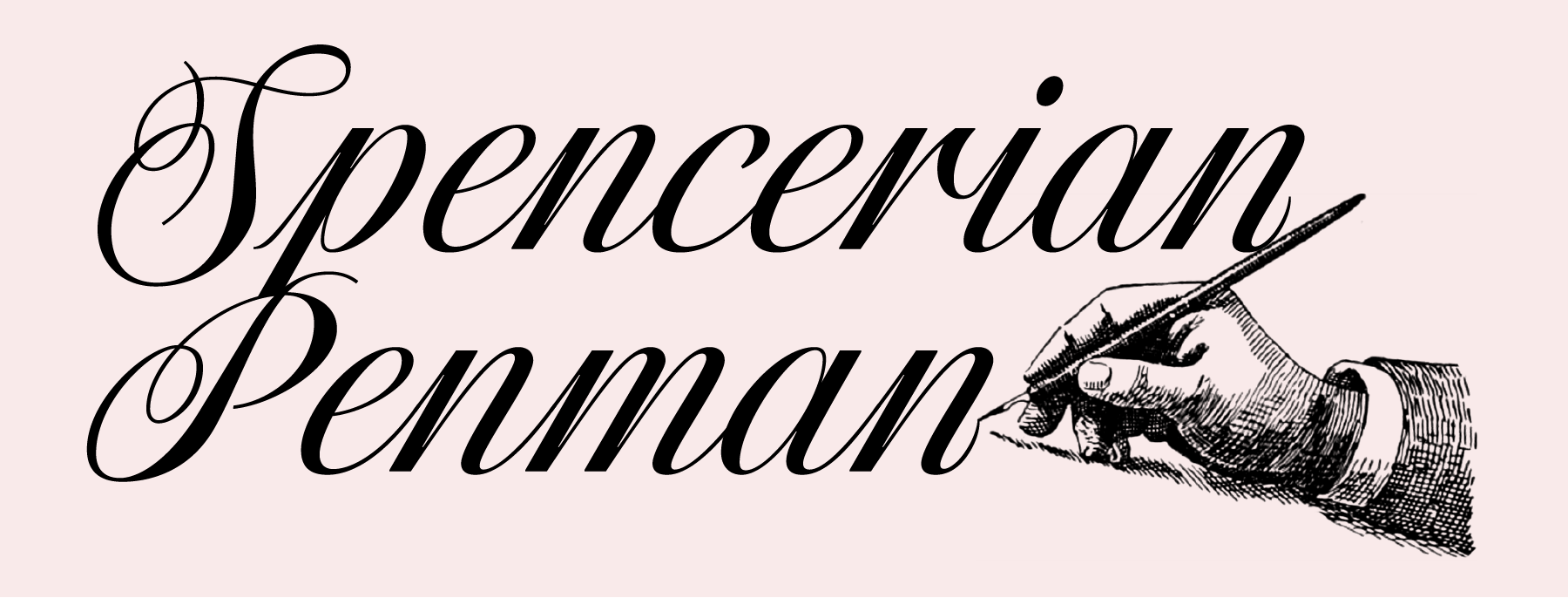
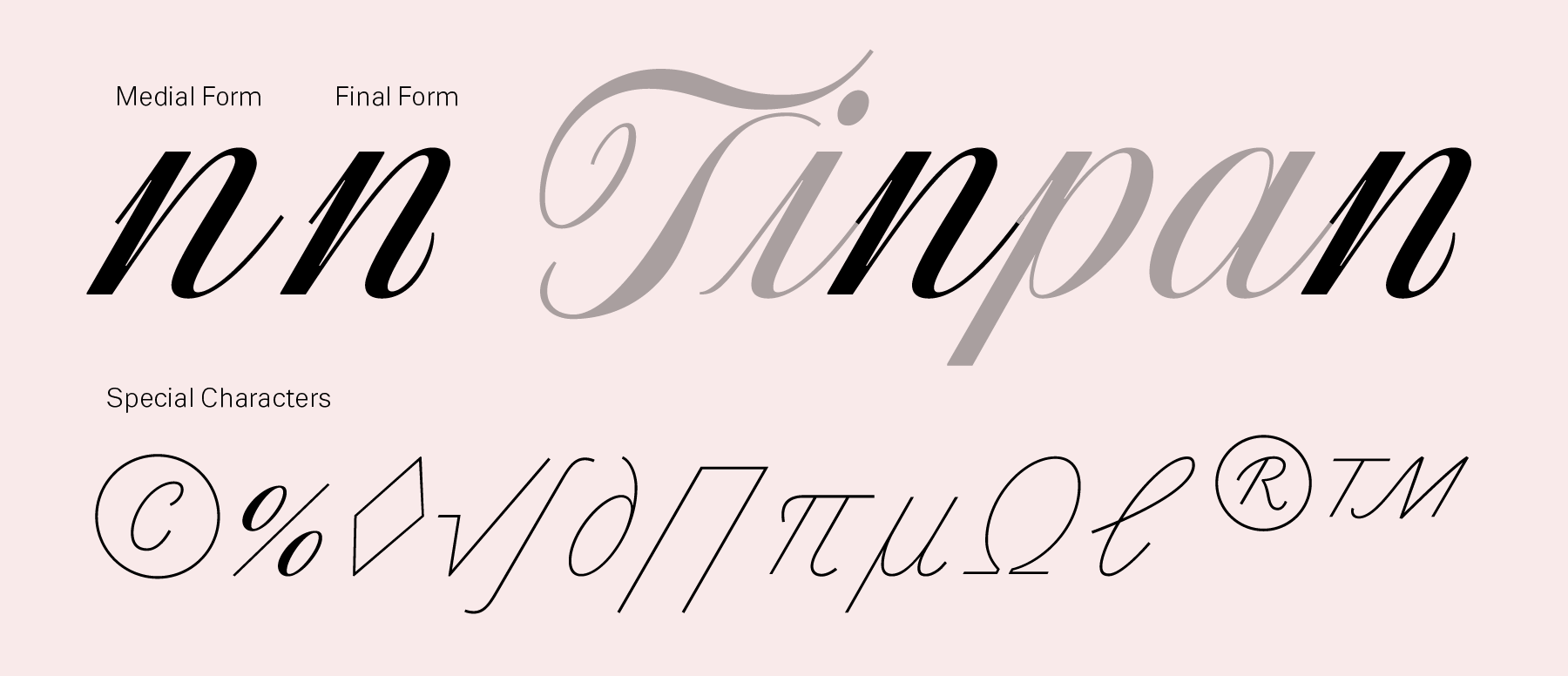
Spencerio may be the best typeface yet in the ITF library for the creation of unique monograms, but it is really an excellent choice for any design application calling for a formal script. This could be a calling card, certificate, diploma, invitation, or anything associated with a wedding. Spencerio’s character set includes 673 glyphs, or almost double the amount necessary to transcribe text in all commonly-spoken European languages written with the Latin script. The approximately 300 ‘extra’ glyphs in Spencerio include ligatures and alternate forms, particularly initial and final letterforms, which may be accessed simply by activating the Standard Ligatures feature in most layout apps. Many of Spencerio’s special characters – such as mathematical symbols, computer coding characters, and commercial symbols like copyright registered, or trademark – are ‘written’ entirely with hairlines and exhibit no stroke-contrast. This way, they fall into the background of the text, and do not distract from the essential message.
Quantum Rounded
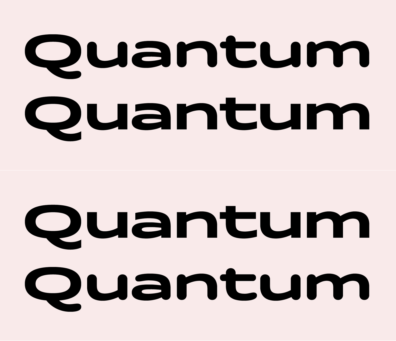
For over a decade, fonts with rounded terminals have signified friendliness. Corporations around the world use them when they want to suggest an internal openness towards their customers. In some ways, Quantum Rounded is the opposite of a formal handwriting design like Spencerio. Spencerio is for special occasions, while Quantum Rounded is for headlines and other short text passages in every-day corporate communications. In comparison with Quantum, Quantum Rounded is much less ‘technical’ in appearance. It is less ‘mid-century modern,’ and more of the ‘social media’ age. Like Quantum, it offers users a palette of five different styles. A number of fine details stand out in Quantum Rounded’s character set. For example, there is a double-storey ‘a’ combined with a single-storey ‘g’. The typeface’s bowls swell outward and upward, particularly in the capitals ‘B,’ ‘D,’ ‘P,’ and ‘R.’ Meanwhile, the letters ‘K,’ ‘Q,’ ‘R,’ and ‘k’ each have curved tails on the out-strokes of their lower diagonals. The ampersand has a simplified form recalling the ‘Et’ ligature that caused the character to be invented in the first place. Quantum Rounded’s at-symbols align nicely in text, too.
