This May, the Indian Type Foundry is pleased to add two more Latin-script families to its growing roster of typefaces. One of them was developed in-house at ITF; the other is from an international trio of Paris-based designers. ITF may be best-known for Indian-scripts typefaces, but Latin-script type design is an important element of our business, too. As Satya Rajpurohit – one of ITF’s co-founders – stated in a recent interview, ‘many clients only come to us to buy Indian fonts. But I thought it would be good to design Latin fonts as well; also because English is the second official language in India. Almost every graphic design projects in India uses English, and offering Latin typefaces is also a way to open up to an international market.’ In this spirit, we are pleased to present you with Diodrum and Torrent, and we’re interested to see what designers around the world will create with them.
Diodrum

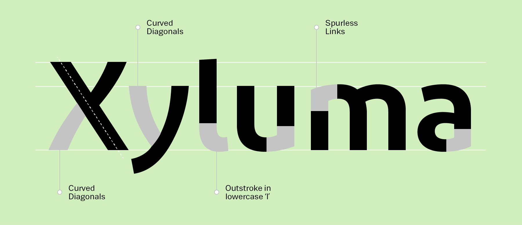
Diodrum is a spurless sans family for the Latin script. ‘Spurless’ typefaces feature smooth transitions from letters’ stems into their curved strokes. A quick look at Diodrum’s lowercase ’n’ illustrates this perfectly – in typical sans serif faces, there might still be spur on top of the letter’s top-left corner. While some letters in the Diodrum family include a modicum of stroke contrast, the design these typefaces is generally monolinear. The family’s x-height has been set high, and the counterforms are large and open. This makes Diodrum appear friendly, in addition to being legible. Another design feature is visible in the typeface’s diagonals: instead of their being drawn with straight lines, Diodrum’s diagonals swell outwards. These curves give letters with prominent diagonals (‘K,’ ‘V,’ ‘W’ … even the ’N’) an increased dynamism.
Diodrum is available in six weights, and the lightest of these six styles is an ExtraLight font – a unique addition to our library. Because of its multiple weights, versatile range, and formal style, Diodrum is an excellent choice for usage in Corporate Design and UI/UX Design applications.
Perhaps unusual for a typeface family of this size, Diodrum is the creation of three Paris-based type designers working together: Jérémie Hornus, Clara Jullien, and Alisa Nowak. Although Hornus is now in Paris, he previously studied and worked in England; Nowak is a German, but she studied in France and now resides there. None of Diodrum’s designers have released typefaces through ITF previously; this is their Indian Type Foundry debut.
Torrent
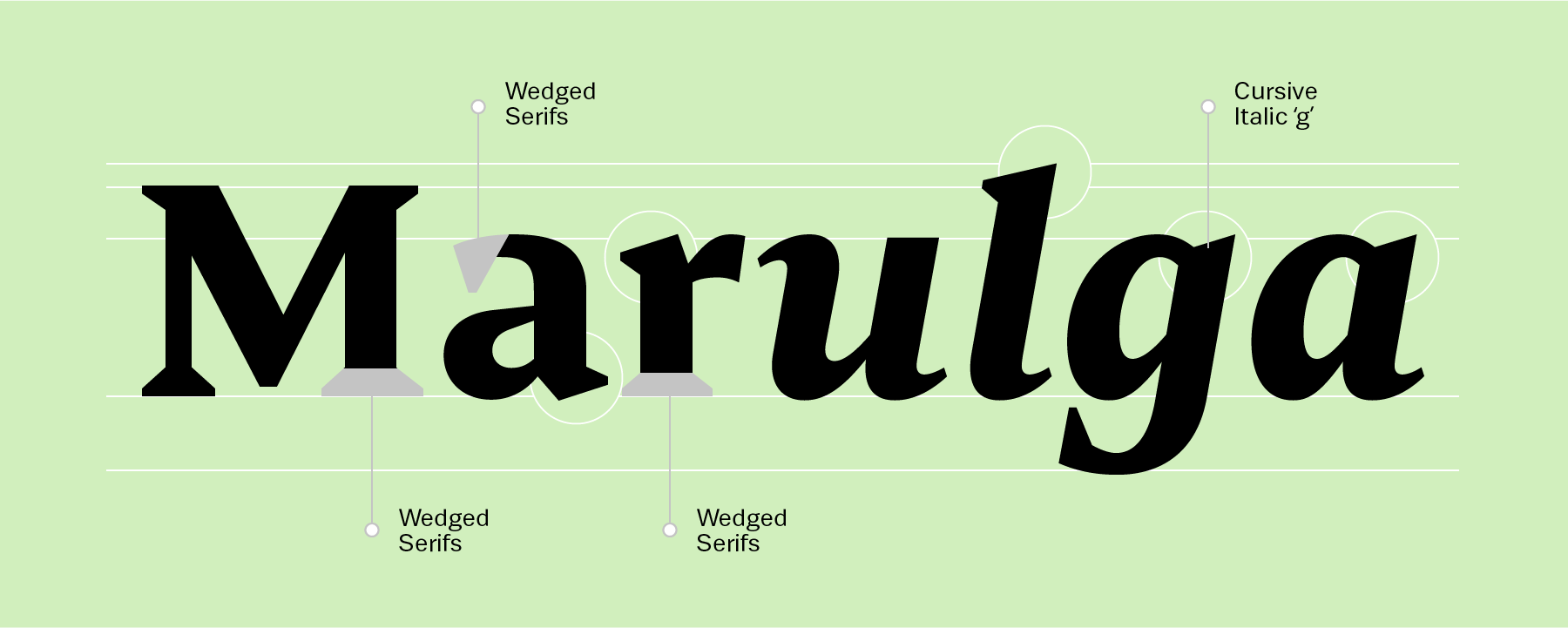
The Torrent family is a multi-purpose typeface with large wedge-formed serifs. Like Diodrum, Torrent’s letters have a tall x-height and wide-open counterforms. Some joins have been opened up, too – between the straights and the diagonals of ‘K’ and ‘k,’ as well as the vertical center of the ‘R,’ for instance. Unlike Diodrum, Torrent’s letterforms have a higher stroke-contrast model, one that is typical for serif typefaces that are intended for use in lengthy passages of text. Indeed, Torrent is a highly readable text face and will look clear even when used in less-than-optimal printing situations (cheaper paper and ink, high-speed presses, etc.).
In smaller sizes, Torrent’s wedge-shaped serifs won’t suffer any loss of detail. In fact, wedges of this sort are a hallmark of contemporary serif type design. Torrent is an excellent serif choice for use in book design or editorial design work, as well as in magazines, packaging, and publication design applications. The Torrent family currently includes five weights, from Light through Bold. Each font has 384 glyphs in its character set. Manushi Parikh designed Torrent at ITF in 2015; she has already published several families with us, including Begum Devanagari, Latin and Tamil, Director Devanagari and Latin, as well as Mute.