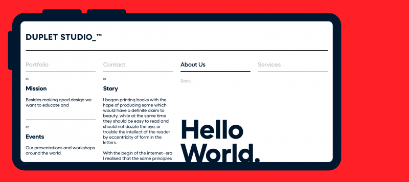
When you are looking for a typeface that can carry a tech message to readers, helps make communication easier and looks good, too – chances are high that you’ll select a geometric sans serif. These are the typefaces of today and tomorrow. From the headlines on news websites to the texts in apps and even company logos rendered large or small, geometric sans serifs are everywhere.

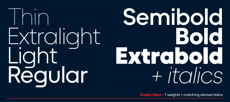
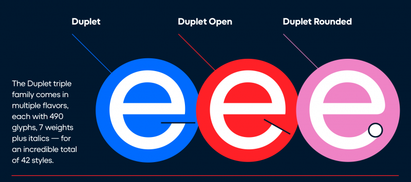
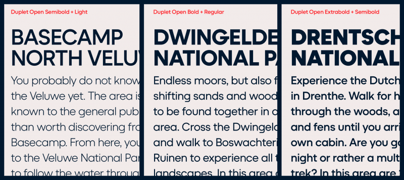
Since it is part of the Duplet superfamily, you can combine Duplet Open with its relatives: Duplet and Duplet Rounded. Each contains seven weights ranging from Thin through ExtraBold, all with companion italics. The fonts include more than 450 glyphs, covering all the European languages written with the Latin script.

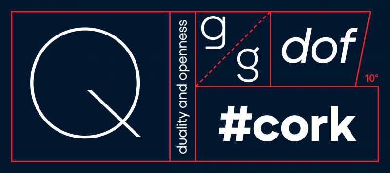
Since the Duplet Open fonts are geometric, the round characters and round-parts of letters appear either as circles or slanted circular forms (like you see in the italics). Duplet Open’s letterforms are very low-contrast with strokes that seem even in thickness. On letters like ‘e’ and ‘s’, the strokes also end in diagonal shears rather than horizontals. That makes the letters’ counters more open. They render a little less dark and may even be slightly more legible at small sizes or on screen than ITF’s Duplet family.

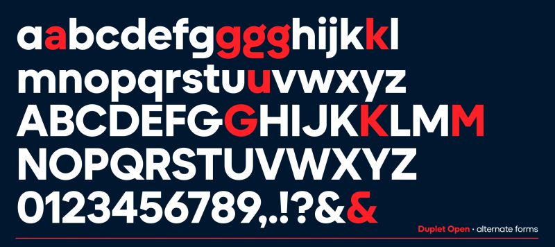
The default form of the ‘a’ in each font is single-storey. The large round bowl drives Duplet Open’s inherent geometry home! But there is a double-storey ‘a’ as an OpenType alternate ‘a’. The default ‘g’ is also single-story, and its bottom stroke is flattened, giving it a streamlined, less-complicated look. Duplet Open’s fonts feature three more ‘g’ versions as alternate characters.

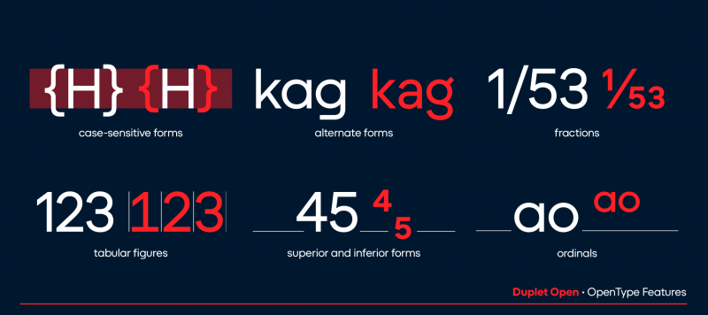
There are alternates for ‘k’, ‘u’, ‘G’, ‘K’, and ‘M’, as well as the ampersand (&). The character sets include case-sensitive forms, too — punctuation marks that are vertically repositioned and look better in all-caps texts. When it comes to numerals, both proportional and tabular lining figures are there, as well as fractions, superior numerals, and inferiors. Diana Ovezea and Rafał Buchner designed this typeface with great attention to detail.

Family Name Duplet Open
Designer(s) Diana Ovezea, Rafał Buchner
Release Date February 1, 2022
Available Style Thin, Thin Italic, Extralight, Extralight Italic, Light, Light Italic, Regular, Italic, Semibold, Semibold Italic, Bold, Bold Italic, Extrabold, Extrabold Italic
Classification Sans
Supported Languages Afar, Afrikaans, Albanian, Aranese, Aromanian, Aymara, Azeri (Latin), Basque, Bemba, Bislama, Bosnian, Breton, Catalan, Chamorro, Cheyenne, Chichewa, Chuukese, Cofán, Cornish, Crimean Tatar, Croatian, Czech, Danish, Dutch, English, Esperanto, Estonian, Faroese, Fijian, Finnish, French, Frisian, Friulian, Ga, Galician, Ganda, German, Gikuyu, Greenlandic, Guaraní, Guarani , Gwich’in, Haitian, Hawaiian, Hungarian, Icelandic, Ido, Igbo, Indonesian, Interlingua, Irish Gaelic, Italian, Javanese, Karelian, Kashubian, Kinyarwanda, Kiribati, Kirundi, Kituba , Kurdish (Latin), Ladin, Latvian, Lithuanian, Luxemburgish, Malagasy, Malay, Maltese, Maninka, Manx, Māori, Marshallese, Náhuatl, Nauruan, Navajo, Ndebele (Northern), Ndebele (Southern), Norfuk , Norn, Norwegian (Bokmål), Norwegian (Nynorsk), Nyanja, Occitan, Oromo, Otomi, Palauan, Papiamento, Pedi , Polish, Portuguese, Quechua, Rarotongan, Rhaeto-Romanic, Romaji, Romani, Romanian, Sámi (Inari), Sámi (Lule), Sámi (Northern), Sámi (Southern), Samoan, Sango, Sardinian, Scottish Gaelic, Serbian (Latin), Seychelles Creole, Shona, Silesian, Slovak, Slovene, Somali (Latin), Sorbian, Sotho, Spanish, Swahili, Swati, Swedish, Tagalog (Filipino), Tahitian, Tetum, Tok Pisin, Tokelauan, Tongan, Tsonga, Tswana, Turkish, Tuvalu , Twi, Ulithian, Umbundu , Veps, Vietnamese, Welsh, Wolof, Xhosa, Zulu

Want to try this font family?

You can request a free trial (Professionals) or an educational license (students) by submitting your details below. Once approved, we’ll send you the fonts by Email. Professional trial requests are approved immediately. If you don’t see the email in your inbox, please check your spam folder.

Professional Trial Licenses are valid upto 15 days. You will be notified (via email) prior to the License's expiration. These fonts can be used only for testing in potential projects or in non-commercial work. To use these fonts for commercial projects, the appropriate license must be purchased.

Select file
Drag and Drop
0%

Trial licenses are valid for the period of your educational career with the mentioned institution. You will be notified (via email) prior to the License's expiration These fonts can be used for Educational/non-commercial work only.

Duplet Open
0 pts
0 pts
Go to
Grumpy
0 pts
0 pts
Go to
One morning, when Gregor Samsa woke from troubled dreams, he found himself transformed in his bed into a horrible vermin.
0 pts
0 pts
Go to
He lay on his armour-like back, and if he lifted his head a little he could see his brown belly, slightly domed and divided by arches into stiff sections. The bedding was hardly able to cover it and seemed ready to slide off any moment. His many legs, pitifully thin compared with the size of the rest of him, waved about helplessly as he looked. The Metamorphosis is a short story, sometimes regarded as a novella, by Franz Kafka, first published in 1915. It has been cited as one of the seminal works of fiction of the 20th century and is studied in colleges and universities across the Western world.
I’m looking for a font for
Indian Type Foundry © 2016 - 2025