This week, the Indian Type Foundry is pleased to announce the release of two new sans serif typefaces for the Latin script: Volte and Pancho. Volte was designed by Namrata Goyal at ITF in Ahmedabad. The family is a geometric sans, but it differentiates itself from many typefaces in that genre. While Volte retains a feeling common to all geometric sans types, some simplification and reduction is visible in its letters. This is particularly the case with the capital ‘G,’ for instance, which has no horizontal bar.
Volte
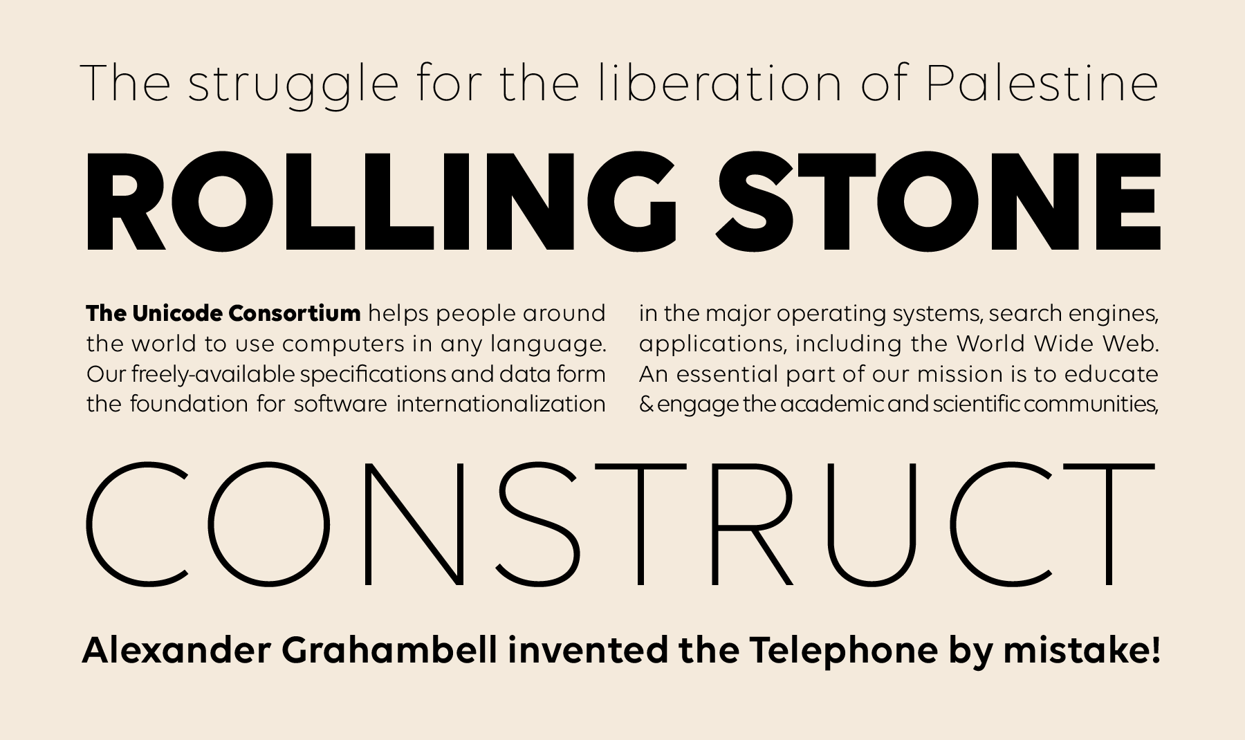
Connoisseurs of geometric sans types will instantly notice that Volte’s ‘a’ and ‘g’ take the single-storey forms common in most geometric sans serif designs. The strokes in Volte’s letterforms are drawn so that they appear optically monolinear. Volte diverges from typical geometric interpretations with its straight-topped ‘3,’ as well as with the curls on the out-stroke of the ‘t’ and the descender of the ‘y.’ Some of Volte’s letters are very open: the ‘G,’ ‘M,’ and ’S,’ for example, and also the ampersand and question marks. The lowercase ‘k’ appears more constructed than geometric, but this solution was arrived at to open up the letter’s counters. The full-stop character – repeated in many punctuation marks – is round. The apostrophes take a simple wedge-shaped form.
Pancho
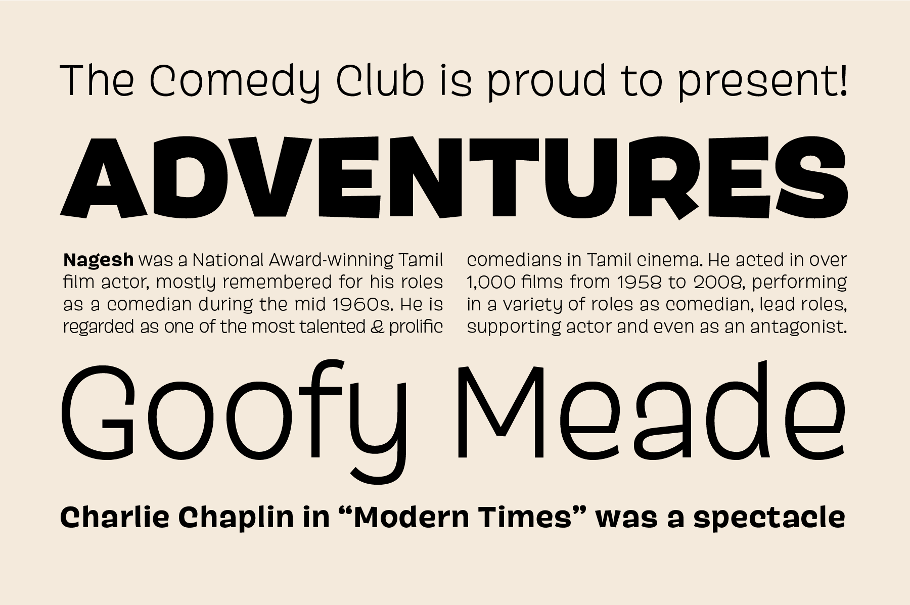
Pancho is a very informal design. Despite also being a sans serif family, it could not look more different from Volte. Most ITF typefaces are rather serious; this is not the case with Pancho. The impetus for the Pancho’s design lies in a conversation that Shiva Nallaperumal, Pancho’s designer, had with Satya Rajpurohit, one of ITF’s co-founders. They discussed the word “Pancho,” which they both thought had an interesting sound, and they wondered if it would be possible to design an entire typeface with the name as a starting point. Typefaces normally receive their name at the very end of the design process, just before their release.
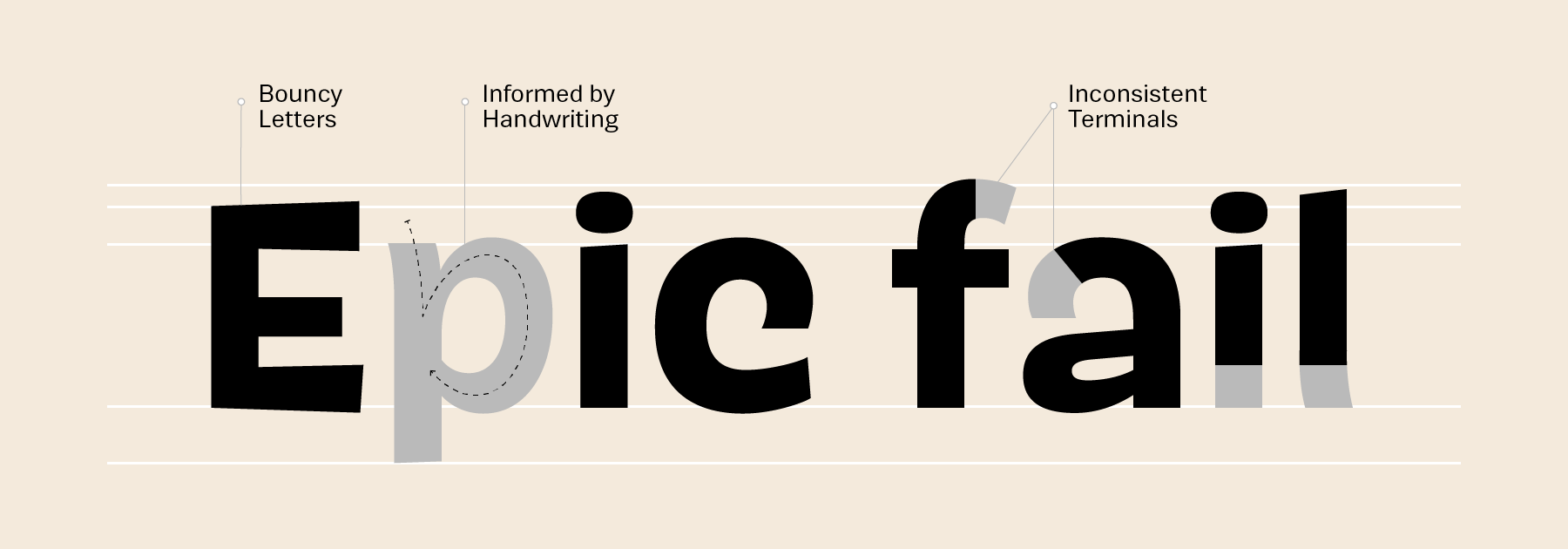
So the brief for Pancho was make some both light-hearted and subversive. Rising to the occasion, Shiva developed Pancho as the jester in ITF’s catalogue; the typeface brings some comic relief to our library. Pancho’s letters are round and irregular. Some strokes end in horizontal or vertical shears, others are cut off along a diagonal. In most cases, the top halves of Pancho’s letters have been drawn so that they appear larger and heavier than their bottoms; this is a trait that was used to great effect by Roger Excoffon in the 1950s for the design of Antique Olive. There is something of an Excoffon feel to Pancho – just look at the form of the capital “O,” which has a shape similar to an egg, a direct reference to Antique Olive.
Although Shiva Nallaperumal is originally from Chennai, he currently lives in Baltimore/Maryland, where he is finishing up an MFA in Graphic Design at Maryland Institute College of Art (MICA). Many of ITFs typefaces are used in the United States, but Pancho is the first to be designed there. At MICA, Shiva has studied under several well-known American graphic designers, including Ellen Lupton and the type designer Tal Leming. Pancho shows subtle influences from Leming’s own design practice, and it is clear that the type designs of Letterror in the Netherlands are a further source of inspiration for him.
The Volte and Pancho families each include five weights: Light, Regular, Medium, Semibold, and Bold. Volte’s fonts have character sets with 381 glyphs, while Pancho’s have 379. These character sets offer support for most Western, Central, and Eastern European languages written with the Latin script.