The Indian Type Foundry is very pleased to announce the publication of its two newest display typefaces, Eileen and Bobo. Both selections come to us from French type designers. Each is a refreshingly decorative interpretation of the geometric sans serif genre. Eileen is an art-deco-style typeface with five weights.Bobo is a single-weight family, but it contains quite a bit of variation within just one font file. In terms of style, Bobo is rather cutting-edge and contemporary, rooted in the “twenty-one-teens,” whereas Eileen references the nineteen-twenties. You might call Bobo a “hipster font;” we call it an exciting addition to your typographic palette.
Eileen
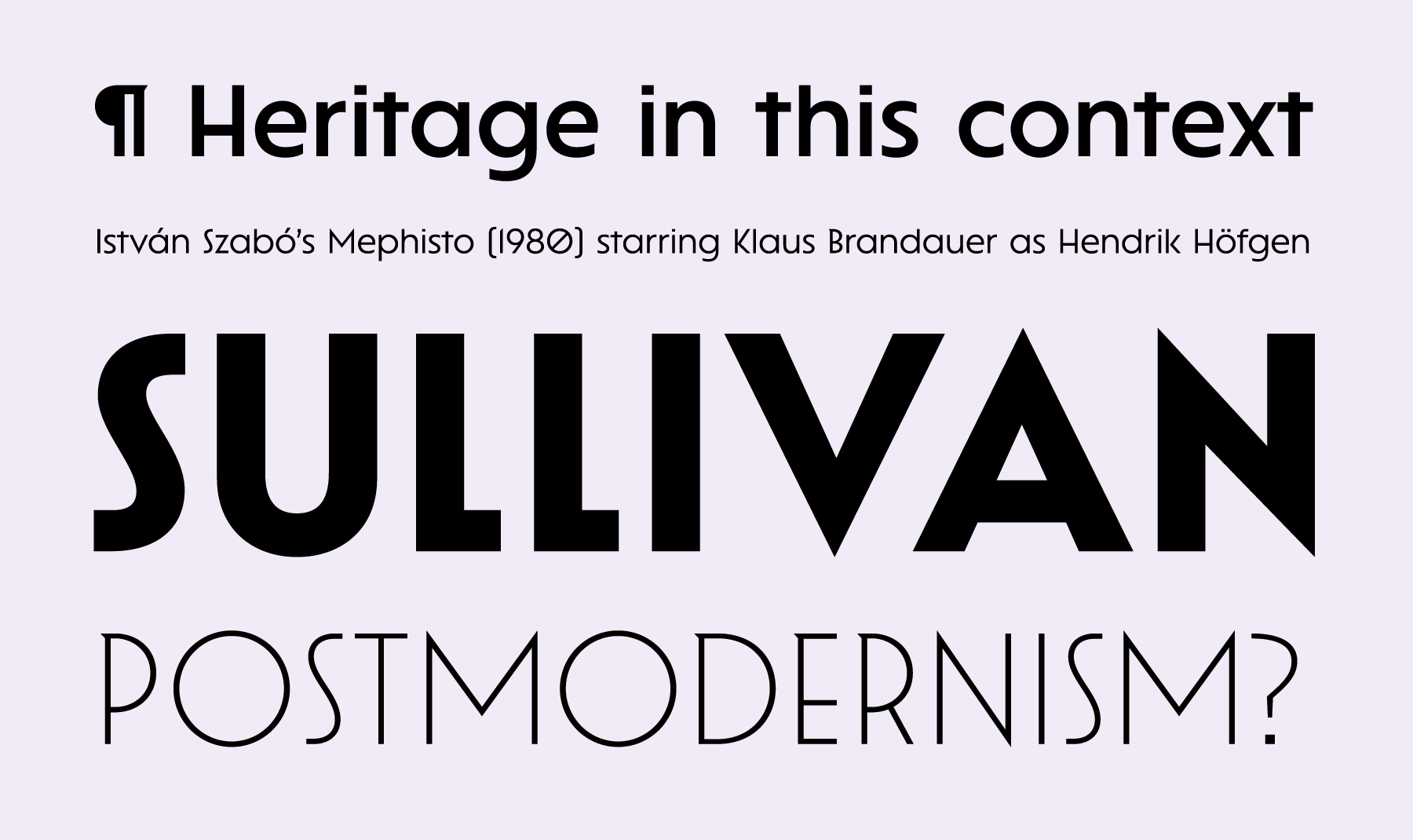
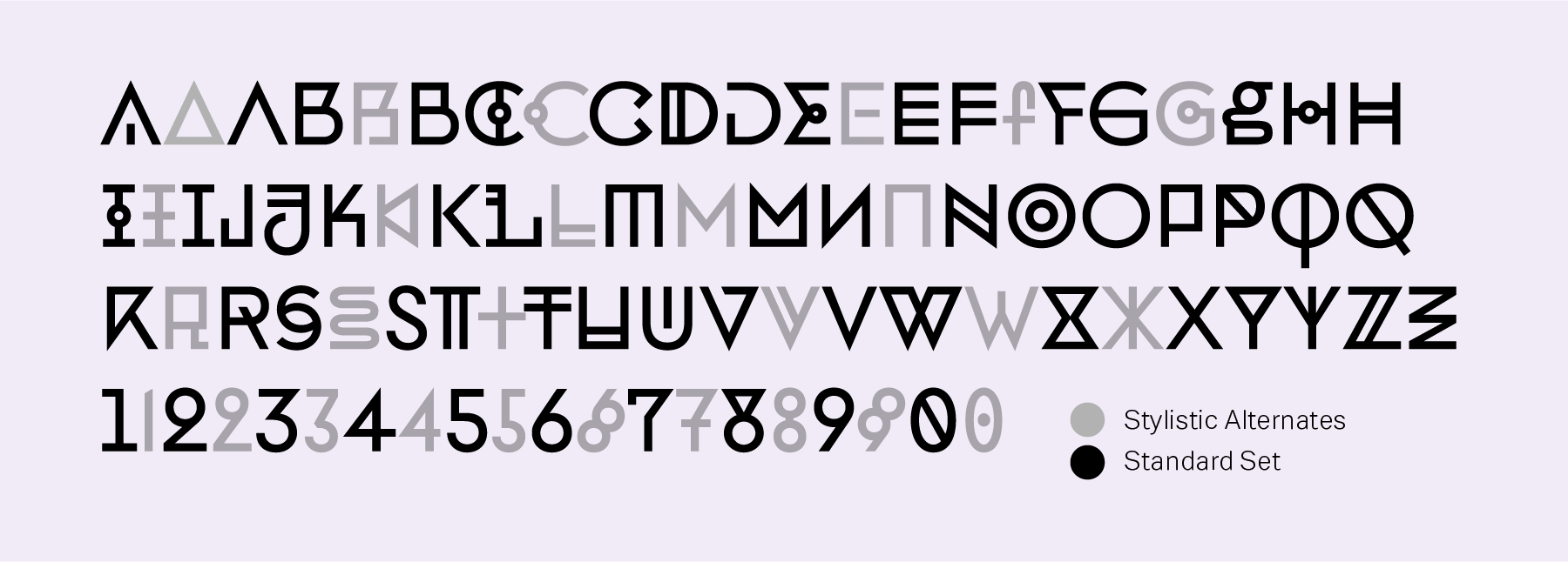
In its design language, Eileen mixes two popular sans serif styles from the 1920s: its capital letters are art deco, while the lowercase is geometric. The lowercase letters also include a number of constructed features: the “a” and “g” are both single-storey, while the bottoms of “t” and “y” have each been straightened out. The cedilla takes the form of a simple vertical stroke, too. Pointy apexes on the bottoms of “v” and “w” reference the uppercase letters. Each font contains alternate forms of “ C,” “G,” “J” and “S.” The default “C” and “G” are full, round letters; they are almost as wide as the “O.” The alternate “C” and “G” variants are narrow and more decorative; their forms are half-circular, and they appear to be only half as wide as the “O.” The alternate “J” is a narrower, longer form of that letter, with a descender; the standard “J” has no descender, and a top serif. The alternate “S” has a streamlined diagonal form. Some of the non-alphabetic characters are unique, such as the narrow dollar and rupee currency symbols, as well as the brave ampersand and reductionist section mark.
Bobo
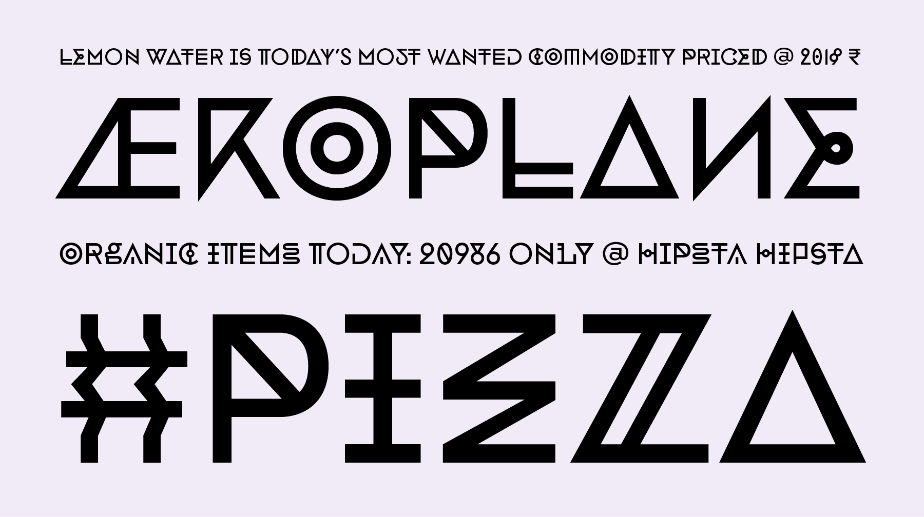
Although Bobo is a just a single uppercase-only font, it contains a lot of variety. There are three complete sets of capitals: one is mapped to the font’s uppercase letters, one to the lowercase letters, and one as a stylistic set for uppecase under SS01. Along with even more dynamic versions of the numerals (0–9), these alternate glyphs are stored in a Stylistic Set – accessible via an OpenType feature. Bobo is a study in geometric-ornamented variation: some of the typeface’s letterforms have strokes that have been doubled, while others are missing typical elements (repetition is a key feature of Bobo’s design). Other letterforms are mirrored. Some arrive at unicase solutions, while others still have been made quite narrow. The design even included several “jewelled” letterforms, with circles in their centers, which are reminiscent both of medieval illuminated manuscript lettering and French ornamented typefaces from the eighteenth century. Bobo features non-alphabetic characters that also match with each other, such as the ampersand and at-symbol, which feature a similar flat top to the “3.” The rest of the numerals are just as decorative as the letters; the “2” has a closed-form top that matches the “6” and the “9.” The typeface’s .notdef is a skull – a particularly wicked-looking one at that!
Eileen is named after the Irish furniture designer Eileen Gray (1878–1976). Her most-iconic design is circular glass table from the 1920s, which made use of curved steel tubing. She was a pioneering Modernist, and this typeface is a fitting typographic tribute to her work. The name Bobo refers to individuals who incorporate values of both 1960s counterculture and 1980s materialism; Bobo stands for “BOurgeois BOhemian.” Eileen and Bobo are the second ITF releases of their respective designers. Eileen is from Julie Soudanne, and Bobo is from Jean-Baptiste Morizot. Each are based in Paris, France. They worked together with Alisa Nowak to design the Graphico family, which we released just a few weeks ago.