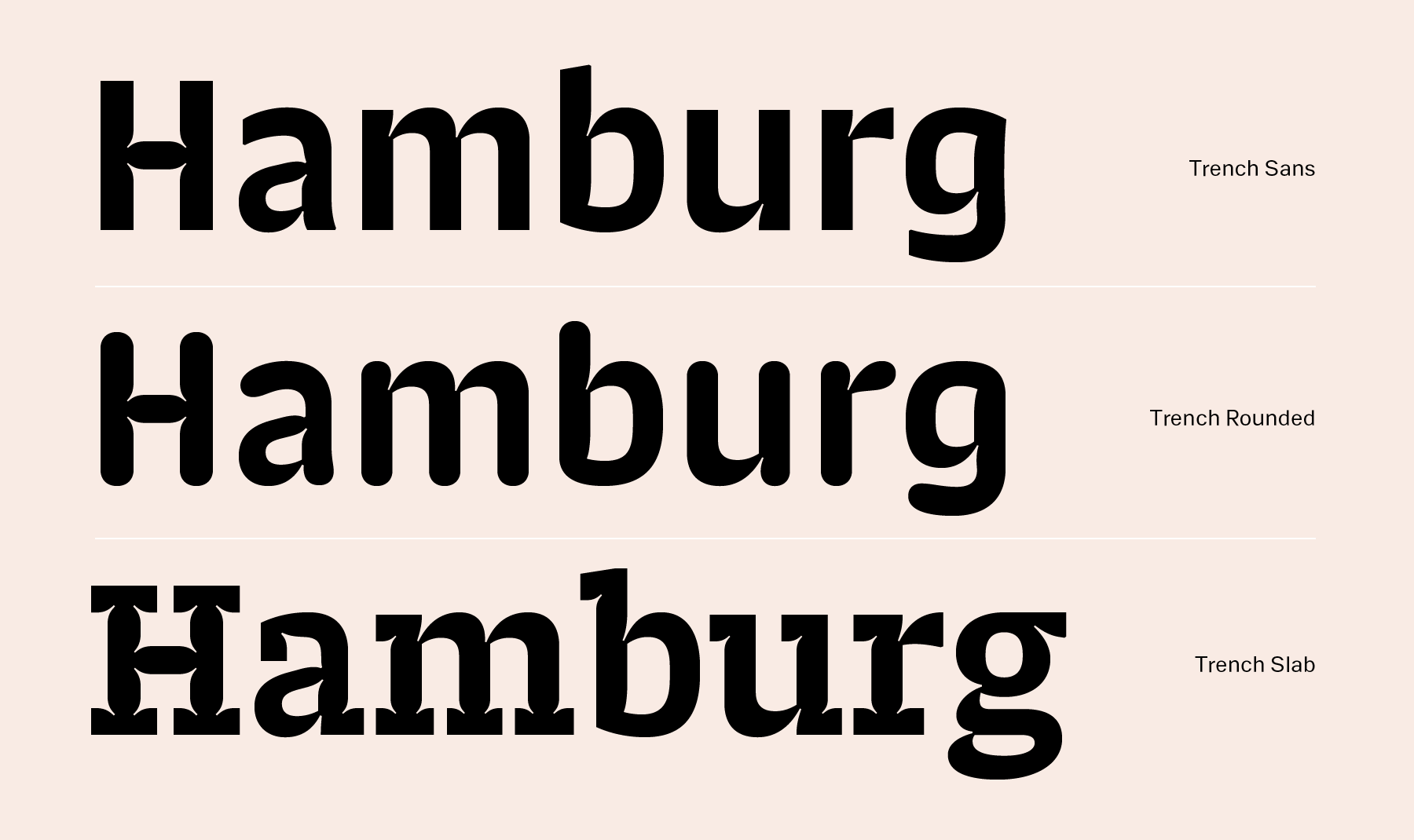
The Indian Type Foundry’s Trench superfamily is the third release by Shiva Nallaperumal in less than a year. Each new typeface by Shiva is bigger than the last; while Pancho had five weights, and Khang six, the Trench superfamily offers its users 15 fonts. There are three subfamilies of five styles each: Trench Sans has been optimized for use in very, very small point sizes. Trench Rounded and Trench Slab, on the other hand, are each intended for display use. All three entries in the Trench series can be used to set general purpose texts meant for reading, too.
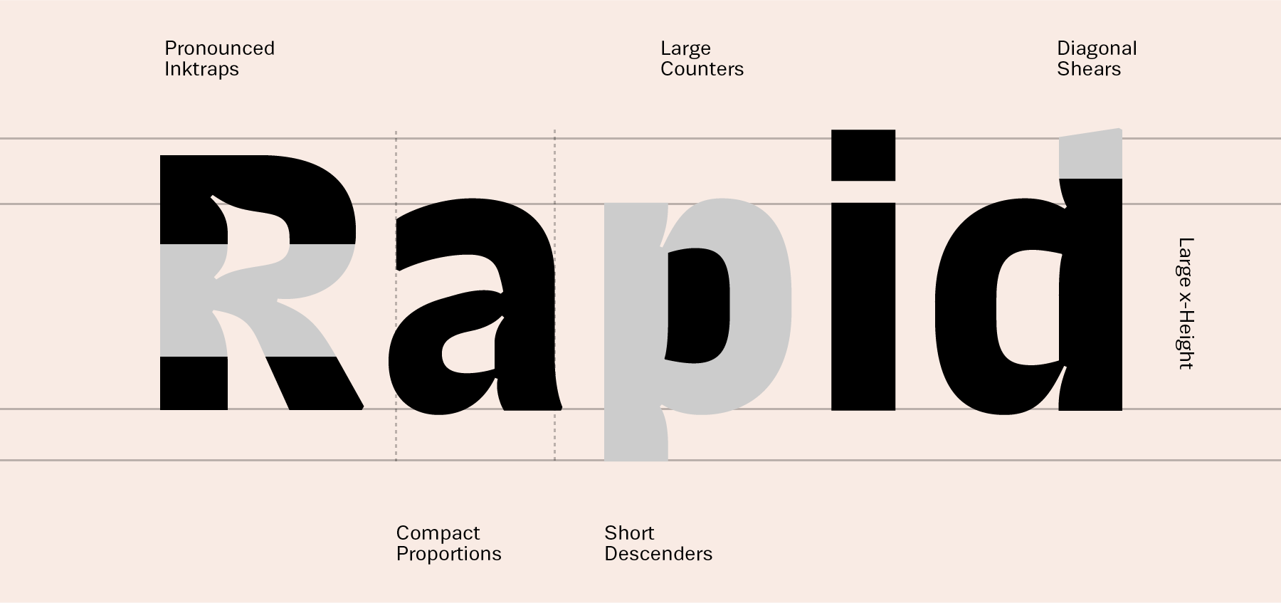
Shiva has long been fascinated by agate typefaces, or fonts specially designed for the smallest texts in newspapers and other things printed in poor conditions. An “agate” in-and-of-itself is a a unit of typographical measure 5.5 points high (about 1/14 of an inch). Many agate types feature “ink-traps” as part of their design. These are little wells in corners where ink would otherwise clog-up and make the printing appear too dark. Ink-traps are just one of many size-specific adjustments made to agate types; they often have wider letterspacing, too. The most famous typeface in the agate genre is Bell Centennial, designed by Matthew Carter for use in American telephone books during the 1970s. It is commonly used today in much larger sizes by graphic designers all over the world – you might recognize its exaggerated ink-traps. Christian Schwartz’s Amplitude – designed about 15 years ago – makes use of sharper, razor-cut ink-traps in its design.
Shiva's process for Trench Sans started in a similar vein, but with a different source: there is a popular news magazine in India that uses an agate face, with pronounced ink-traps, on glossy paper in a not-so-small size. This was definitely not a conscious design choiceand after seeing this odd, condensed ink-trap-filled typeface being used in medium sizes, Shiva felt there was potential to use ink-traps outside of their functional uses. The idea for his next typeface was planted. He began experimenting with ink-traps as a stylistic feature in various pieces of lettering that he made while he was graduate student in graphic design at MICA in Baltimore. ITF’s Satya Rajpurohit suggested that he take these ideas more seriously, and come up with a working typeface that still retained something of their original concept. More research into fonts for small sizes led him to understand and incorporate several functional aspects into his design: compact letter shapes, open counters, appropriate spacing, short descenders to accommodate for tighter text-setting, etc. Just adding ink-traps everywhere doesn’t make for a good micro face. The result of this hard work is Trench Sans, a five-style family of agate fonts that work well in 5–10 pt size.
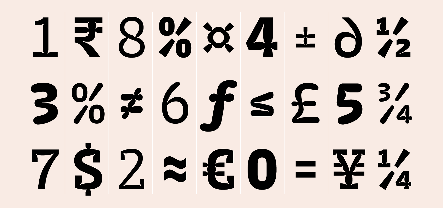
All the Trench fonts have tabular setting for all numerals and numeric symbols as the default feature. This means that the numerals and symbols have the same letter widths among all weights. This is particularly useful for setting tables and numeric data of any kind.
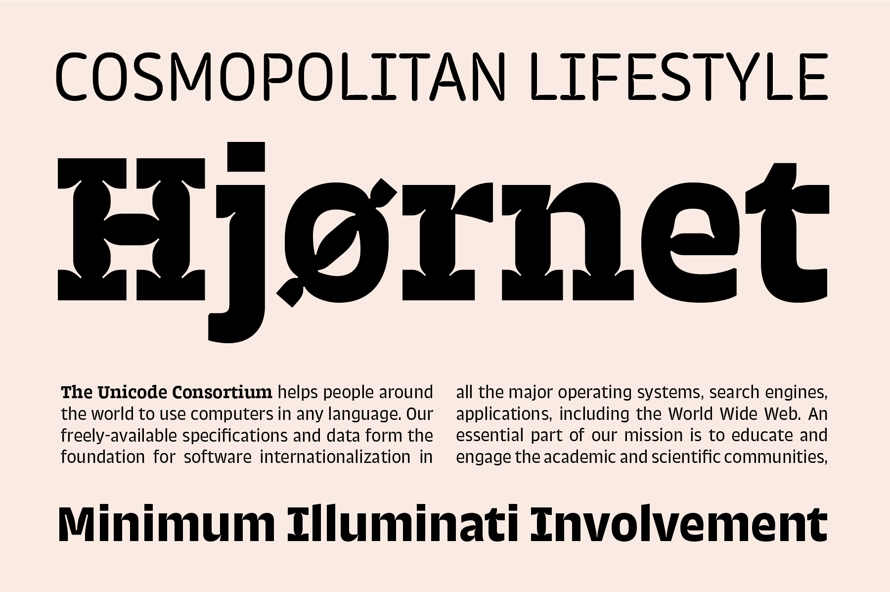
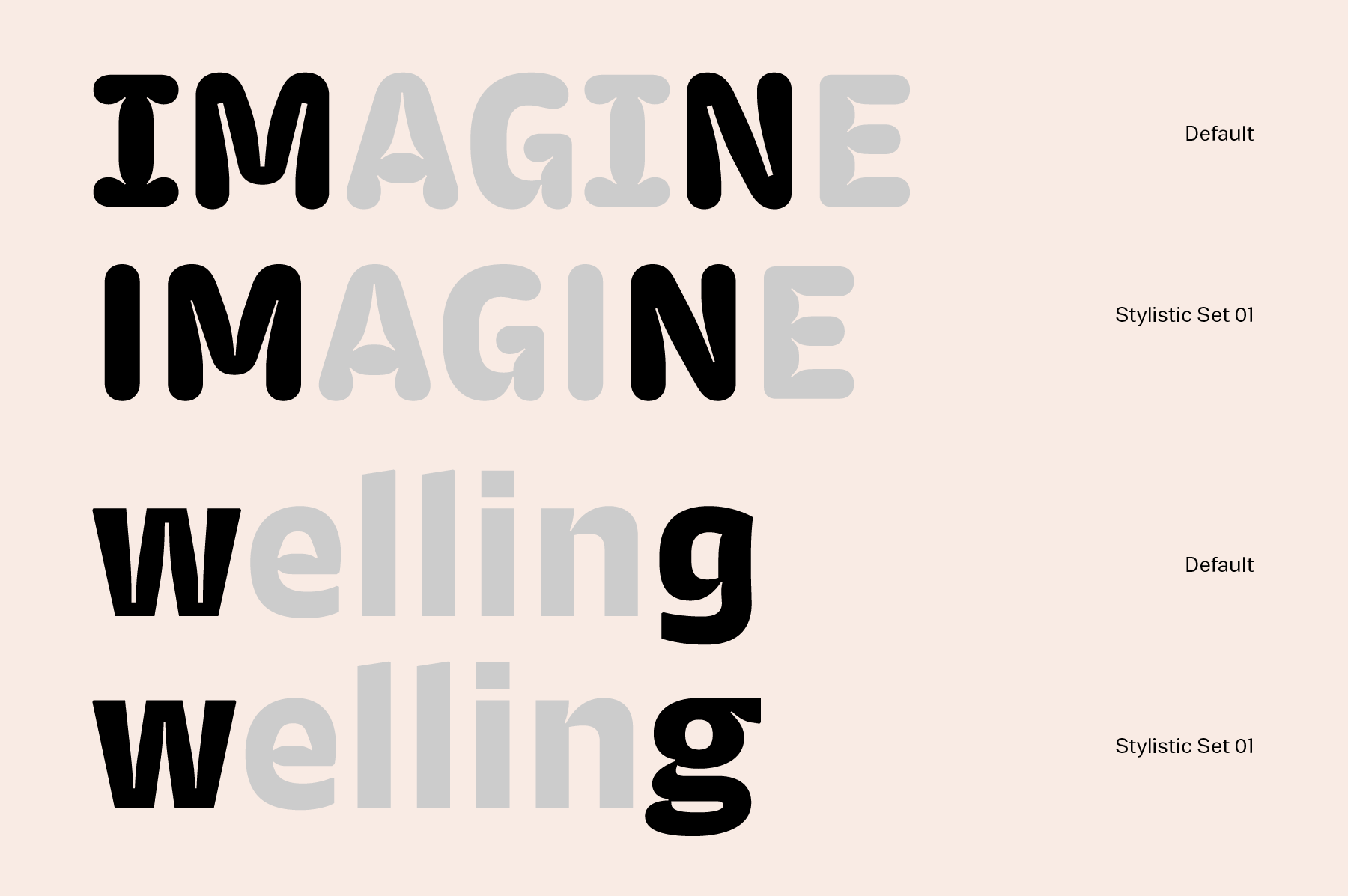
Trench Sans is accompanied by two display-typography siblings: Trench Rounded and Trench Slab. Trench Rounded is a rounded-sans take on Trench Sans, for use in larger point sizes. As its name implies, Trench Slab is the Trench series’s slab serif version. Each of the Trench Rounded, Trench Sans, and Trench Slab fonts include 436 glyphs. There are a number of alternates included in each font. The standard form of the capital “I” in all fonts has serifs; the “a” is two-storied and the “g” is single-storied. Over stylistic sets, users can access a capital “I” without serifs, a double-storied “g”, and alternate forms of “M”, “N”, “W”, and “w” that are especially designed for display uses.
In spirit, Trench Rounded was inspired by one of Shiva's favorite pieces from graphic design history: Wim Crouwel’s exhibition poster for the sculptor Claes Oldenburg. Its letterforms featured huge, rounded, cushion-like letterforms. They had distinct ink-traps, too – but in this sense, they gave the letters enough depth to echo the softness in Oldenburg’s sculpture. Trench Slab’s origin was much more whimsical. Taking a break from the main work on Trench Sans, Shiva added slab serifs to the “H”. Right then and there, he saw that Trench Sans had the potential to turn into his biggest family yet.