This April, the Indian Type Foundry is very pleased to announce the release of four new Devanagari typefaces. Each of them – Koyla Devanagari, Pancho Devanagari, Sanchar Devanagari, and Volte Devanagari – is a unique typographic interpretations of the Devanagari script and a welcome tool for designers and developers working with text in languages like Hindi, Marathi, or Nepali. The four typefaces represents various typographic genre; there is a geometric sans, a humanist sans, an informal sans, and a wide, high-contrast reversed stress display face. Both Koyla Devanagari and Pancho Devanagari are whimsical lightheaded typefaces with a lot of personality. Sanchar Devanagari and Volte Devanagari, on the other hand, are more serious typographic workhorse families. Together, the release of these four designs add even more stylistic diversity to the ITF library.
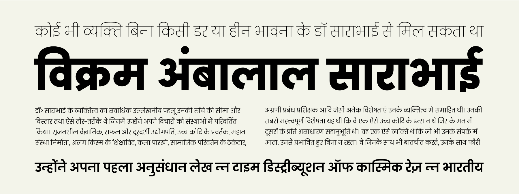
Pancho Devanagari
Pancho Devanagari is a very informal sans serif family, and it is something of a jester in ITF’s otherwise serious catalogue. The typeface brings comic relief to our library. Pancho Devanagari’s family includes five styles, and each font has 750 glyphs. Designed by Lipi Raval, it matches our Pancho Latin family, which was designed by Shiva Nalleperumal and released last month. Like Pancho Latin, Pancho Devanagari pays some tribute to the work of Roger Excoffon. Like his iconic Antiqua Olive typeface, there is a lot of top-heaviness of many of Pancho’s characters. The top halves of the Devanagari a, gha, nna, tha, dha, bha, ra, sha, and sa characters for instance, are very exaggerated, even crazy in their appearance! Many other characters are extremely simplified and have forms that seem inspired by everyday handwriting, like the Devanagari i, ka, kha, nga, jha, tta, ttha, dda, and ha. Pancho Devanagari has rather short matras and ukars in comparison with its base characters’ height.
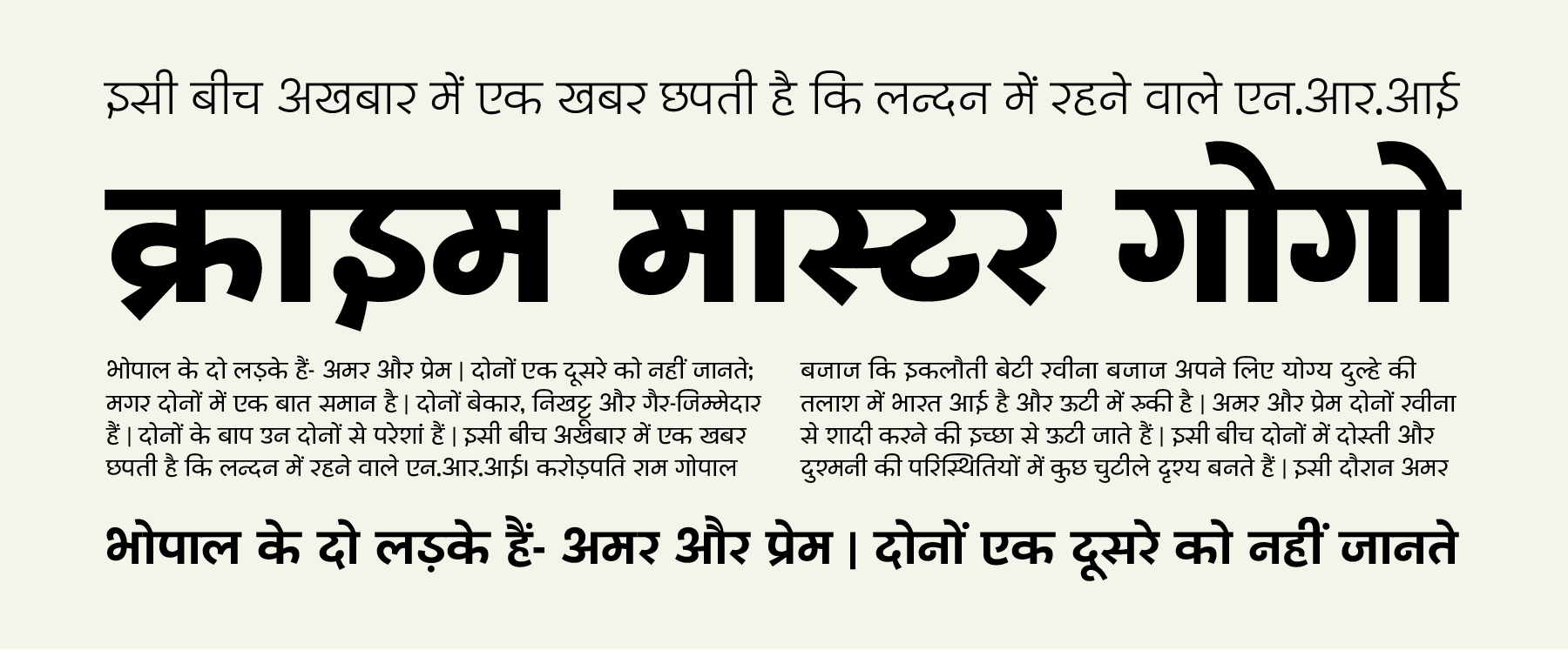
Sanchar Devanagari
Sanchar Devanagari is an elegant humanist family with five weights. Each of these fonts, which range from Light through Bold, include 738 glyphs. The design is by Dhruvi Tolia. Sanchar Devanagari’s letterforms are monolinear, with open counters and some formal simplification – just as can be found in common humanist sans serif typefaces for the Latin script. Sanchar Devanagari’s e, ai, o, and au matras have traditional typographic forms; these matras and the typeface’s ukars are less than half of the general base character height. The characters include real knots, and open loops in characters like cha, ddha, tha, bha, and sha. The two halves of kha are separated, which strengthens the open style of the typeface’s design. Connecting strokes in the characters a, jha, nya, and sa, for instance, are straight, not curved.
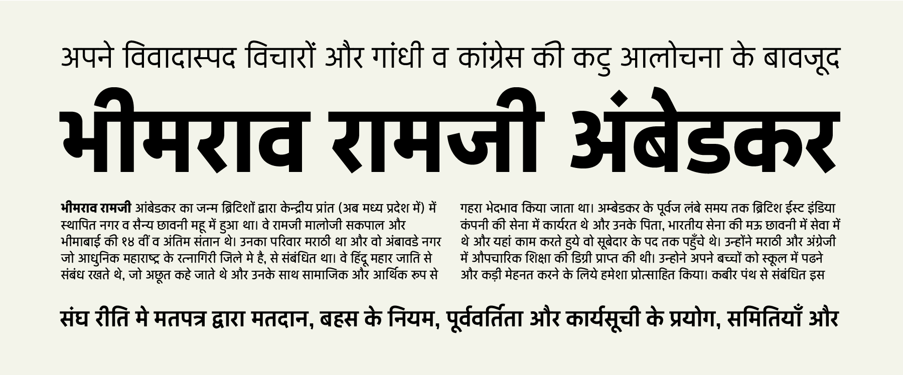
Volte Devanagari
Volte Devanagari is a monolinear geometric sans, designed by Namrata Goyal. Matches Volte Latin, also designed by Goyal and released earlier in 2015. A new voice on the Indian typographic landscape, the Volte Devanagari family offers five weights (Light–Bold), each with 766 glyphs – a streamlined character set equipped with the conjuncts and ligatures needed to render languages written in Devanagari. The typeface’s characters seem constructed out of an array of simple shapes, yet it has a clear typographic sophistication. Wherever you look, you’ll find openness and balance.
Koyla Devanagari
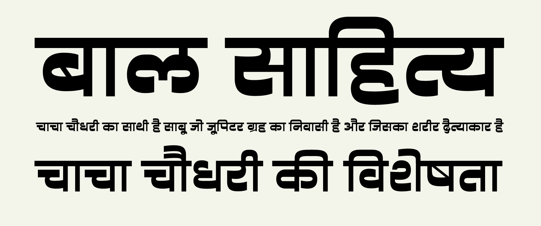
Koyla Devanagari is a single-weight display typeface whose letterforms are both high and reverse contrast. The font includes 758 glyphs. In terms of the details of Koyla Devanagari’s design, its characters feel quite brushy, even though most of its terminals end in vertical shears. All of the dots in the typeface are elongated, with flattened tops/bottoms and rounded sides. All of the typeface’s knots and loops are open, which increases the number of counterforms visible in Koyla Devanagari. The various matras and ukars are not so small, relatively speaking, for a display face – this increases the range of sizes at which Koyla Devanagari may comfortably be set. Not all of the typeface’s horizontal lines are thick; some elements connecting the left and right-hand sides of characters are thin, like Koyla Deavanagari’s vertical strokes. Diagonals are also normally drawn thin, especially if they represent the r consonant in a conjunct, or the below-the-base rakar form; the halant mark is also more of a hairline stroke. Koyla Devanagari was designed at ITF by Ninad Kale.